Showing posts with label theory as practice. Show all posts
Thursday, 8 December 2016
Friday, 21 October 2016
Presentation Development 2

I started planning out what I wanted my PDF to look like. Because of the quick nature of the first presentation, I knew it only needed to be around seven slides long, so stuck to this to fit everything in: it also allowed me to condense my research significantly which kept me to my five minute time constraint.
Keeping each page simple would be hard, as I'd have to condense all the research into a few sentences and then elaborate for each page correctly. I found this challenging as I'm not used to planning out what I'm going to say, I find this is more difficult for me to sound professional and in the right manner.
The first page I'd look at would be to do with the BBC. I set up questions for each page to make the process of writing notes on each one easier.
BBC:
What is BBC?
Narrow down to the TV/modern era, specifically which channels. Brief introduction to the BBC
Ident:
What is an ident?
Examples?
How they impact?
Idents to the BBC:
How they are on BBC 1, 2, 3?
Why are they used?
Who makes them?
Trends of idents: Why they're changing
BBC 3:
Narrow down to the BBC 3 to indicate more research
Why they changed?
Move to online?
How do the idents reflect the target audience?
Branding of Idents:
How do they target their audience?
Or, not?
Reasoning behind why they're branded like that?
Does every ident do this, whats the most famous one? Why?
This would be my plan for each of my slides on what to answer and how to keep the subjects as narrowed down as possible. Specifically, I wanted to go:
Idents > Idents of the BBC > BBC 3 Idents > Target Audience of BBC 3
This would allow me to have a natural progression throughout my PDF, and make it easier for me to progress to each slide.
https://en.wikipedia.org/wiki/BBC_One_%27Rhythm_%26_Movement%27_idents
Monday, 25 April 2016
Lecture: Design
For my final Monday morning lecture presented by Stephen, we looked at the concept of design and thinking, the thought process behind design and how this can benefit us in our current and final project. Firstly, we looked at the Design Council, who developed a diagram that is a simple graphical way of describing the design process. From looking at the diamond in the lecture, I could see how this would feedback into my own work, it seemed very relatable to me.This is something we looked at in the first few weeks, the first section of the diamond starting the project and then leading to the definition stage, the developed and then the delivery stage, when the product is finished. This process is what I've always followed, at each stage I can go back and relate my project to it. The lecture was useful in terms of thinking back to what I've done in my project so far, and allow me to tick off if I've done the right design process.
We then looked over the 7 stages of the design process:
- Refine
- Research
- Ideate
- Prototype
- Select
- Implement
- Learn
"Your job isn’t to make everyone happy. It’s to make your target audience happy."
The lecture reminded me that, with my current project, I need to focus on the target audience: when I've based my work around a certain audience it becomes a lot easier to produce content, as you can narrow down your intentions, design and the writing to suit the best audience - with my current project I hadn't considered this before, so this lecture was a good refresh to go back and consider my intentions for this project - I also felt a lot more confident and content because we'd have to look over the development for our project, plan out the design properly and make sure there is some intention behind each slide. This is what I'd done with my project.
Monday, 18 April 2016
Lecture: Gentle Ease
One of Sara's final lectures, titled "Gentle Ease" was concentrating on the use of After Effects - an Adobe Programme I've been using throughout the year, particularly on my final project, looking at the graph editor and the use of drawing and animation put together. This lecture was of high interest to me because of the topic, and this could be research for my work. A lot of the lecture included visual material, my favourite were the more graphic-based motion pieces, that focused on After Effects to create them, and less of the drawing ones at the start of the lecture.
One piece, "Just One Day" was something of amazing interest to me. Although created via by hand - Stop Motion, it was placed into After Effects and scaled up. Mixing both mediums of the by hand elements and software was something I found interesting - because the objects were all scaled up simultaneously, they don't line up correctly, which he could have done a lot more quicker and efficiently in After Effects, however, the method behind his work took a lot longer to make - it was his own choice, and made the piece move a lot more. The work is really simple too, I love the style that Kelly has created, it's simplistic and shows off the work well.
In contrast to this work, title sequences for TV's - even my own project, is usually done within a few week time frame, and although this is quick and sports a far more professional appearance about it, particularly with the use of the graphics and software they use (it's designed to look sleek, and as professional as intended, without any errors in it) it lacks any exploration. Usually the research for the project is so minimal in the time frame given that they cannot explore their research as thoroughly as they'd like, and thus, maybe not produce the most creative or thoughtful results.
This made me think of our work currently and I'm glad that I separated out a few weeks just for the research, as it made me understand the piece a lot more and create a huge understanding of the work and the topic of choice. I'm glad I followed this route, with Sara's explanation it made a lot more sense to me and made me feel more positive in my choice to neglect creating the sequence at first.
recipesforbakingbread.blogspot.co.uk
Sara's blog and collection of documentation of her work was insightful; currently her focus is to document unbranded products and collecting objects that sort of fit into that. Some Soviet Salt packing, that she only bought a few days before hand, looked unbranded, with green screen printing technique used. It looks extremely aged because of the printing technique used, and without any recognizable branding, in just an old paper form, it ages the work well; although this process must be extremely inefficient at the cost of it - as it looks printed out with screen printing, this wouldn't be a practical way of making products due to the cost.
Sara told us that she was trying to do the same in her work - bring language into the work she is making, by using different methods to create unbranded packaging and something that looks aged, although it is brand new, and throughout her blog documents things that remind her of this process and allow her to research the work very efficiently.
The final video of the seminar was by Drew Tyndell, who's clientelle range from the Carton Network to General Elektriks - he has artist creativity and the main focus for his work is drawing, particularly intertwining the two together to create a colourful moving piece, one of my favourites from the seminar.
The process of the video is called 'romoscoping', a frame by frame concept where you trace from an original image, usually hand-drawn, which gives a beautiful effect that is slightly off-frame for each second, giving a lot more movement to the piece; however it is extremely labour intensive, given how long (3 minutes) the video is, it must have taken Tyndell a long time, a true labour of love. The piece is very light and fresh, and although it hasn't been made very quickly, the energy in the work and the colour shines past the technical process and allows something that looks very vibrant and modern.
Overall this lecture was really interesting tome, intertwining both drawing methods and animation is something that I admire greatly as the work takes a long time to produce ,although the work is defiantly worth it.
In contrast to this work, title sequences for TV's - even my own project, is usually done within a few week time frame, and although this is quick and sports a far more professional appearance about it, particularly with the use of the graphics and software they use (it's designed to look sleek, and as professional as intended, without any errors in it) it lacks any exploration. Usually the research for the project is so minimal in the time frame given that they cannot explore their research as thoroughly as they'd like, and thus, maybe not produce the most creative or thoughtful results.
This made me think of our work currently and I'm glad that I separated out a few weeks just for the research, as it made me understand the piece a lot more and create a huge understanding of the work and the topic of choice. I'm glad I followed this route, with Sara's explanation it made a lot more sense to me and made me feel more positive in my choice to neglect creating the sequence at first.
recipesforbakingbread.blogspot.co.uk
Sara's blog and collection of documentation of her work was insightful; currently her focus is to document unbranded products and collecting objects that sort of fit into that. Some Soviet Salt packing, that she only bought a few days before hand, looked unbranded, with green screen printing technique used. It looks extremely aged because of the printing technique used, and without any recognizable branding, in just an old paper form, it ages the work well; although this process must be extremely inefficient at the cost of it - as it looks printed out with screen printing, this wouldn't be a practical way of making products due to the cost.
Sara told us that she was trying to do the same in her work - bring language into the work she is making, by using different methods to create unbranded packaging and something that looks aged, although it is brand new, and throughout her blog documents things that remind her of this process and allow her to research the work very efficiently.
The final video of the seminar was by Drew Tyndell, who's clientelle range from the Carton Network to General Elektriks - he has artist creativity and the main focus for his work is drawing, particularly intertwining the two together to create a colourful moving piece, one of my favourites from the seminar.
The process of the video is called 'romoscoping', a frame by frame concept where you trace from an original image, usually hand-drawn, which gives a beautiful effect that is slightly off-frame for each second, giving a lot more movement to the piece; however it is extremely labour intensive, given how long (3 minutes) the video is, it must have taken Tyndell a long time, a true labour of love. The piece is very light and fresh, and although it hasn't been made very quickly, the energy in the work and the colour shines past the technical process and allows something that looks very vibrant and modern.
Overall this lecture was really interesting tome, intertwining both drawing methods and animation is something that I admire greatly as the work takes a long time to produce ,although the work is defiantly worth it.
Wednesday, 6 April 2016
Seminar: Essay Feedback
One of the latter seminars with James was looking back at the feedback we'd received from the submission of the first draft of our essay, I'd received a 54/100, which although I'd aimed for much higher, I was quite happy with because after looking over the feedback given by a teacher it made a lot more sense why my grade wasn't as high as I'd intended it to be; I'd started the essay with a completely different intention to sort of what it came out as, so ended up re-writing the introduction to make it suit the essay more.
Thanks to the feedback, I was able to make a lot more sense of the essay - as I've previously said, I struggle to make sense and form sentences properly, this is something that when vocally speaking I also don't do very well, so to have two submissions was extremely helpful to me. I was able to take the grammatical errors in the first submission and flip them, and confidentially get together the correct topic throughout the entire essay. It was nice to have another pair of eyes looking at my work as I'd clearly missed quite a big chunk of errors that were around the piece; I'd made many grammatical errors and wording corrections that needed changing because it didn't make a lot of sense.
James sessions allowed me to view my feedback and discuss it with my peers, particularly it was useful for when we were all struggling to meet the same deadlines - my peers reassured me that I'd done enough and was on track, which allowed me to worry less and concentrate on my other ongoing projects at the time. I found that although I didn't bring my essays in to view for feedback, I could still gain a lot of feedback via the first submission so it made me feel a lot better, instead of doing just one finalised submission, I was able to go back and make the changes that were needed to potentially push the grade of my essay up from a 54.
Thanks to the feedback, I was able to make a lot more sense of the essay - as I've previously said, I struggle to make sense and form sentences properly, this is something that when vocally speaking I also don't do very well, so to have two submissions was extremely helpful to me. I was able to take the grammatical errors in the first submission and flip them, and confidentially get together the correct topic throughout the entire essay. It was nice to have another pair of eyes looking at my work as I'd clearly missed quite a big chunk of errors that were around the piece; I'd made many grammatical errors and wording corrections that needed changing because it didn't make a lot of sense.
James sessions allowed me to view my feedback and discuss it with my peers, particularly it was useful for when we were all struggling to meet the same deadlines - my peers reassured me that I'd done enough and was on track, which allowed me to worry less and concentrate on my other ongoing projects at the time. I found that although I didn't bring my essays in to view for feedback, I could still gain a lot of feedback via the first submission so it made me feel a lot better, instead of doing just one finalised submission, I was able to go back and make the changes that were needed to potentially push the grade of my essay up from a 54.
Monday, 4 April 2016
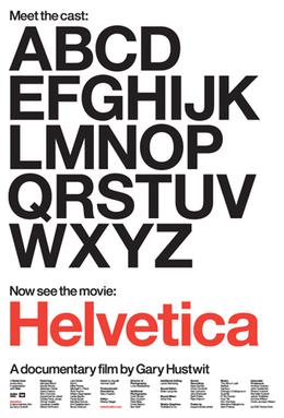
Film: Helvetica
Today's lecture would be around the film 'Helvetica', a documentary by Gary Hustwist (who also created the documentary Urbanized) The film was released in 2007, which was to co-inside with the original release of the typeface.
The 80 minute documentary main focus is the history of the typeface and how it was created, the practicality of the font and the unique differences between creating a typeface now and in the time (1957) the font was formed; having interviews with famous graphic designers and type designers who all give their views on the font, as well as the fact the profession is not very well known - one artist cited that someone didn't know what the profession was when told about it.
Arguably a long film, the documentary in my opinion lacked any interest to me as it was too in-depth for me. Although I love the typeface itself and have used it quite a few times in my work, I disliked the way it was presented and the in-depth knowledge about it, as it sort of became quite tedious over the time of the film. The font itself I love as it can adapt to quite modern times - although made in 1957, it's still famously used today and looks very in-style still, the font is so modern and its flexibility made it one of the most popular fonts of it's time.
The documentary also focuses on the differences between modernist and postmodernists, the post not appreciating the font face and gave it a lot of negative reception. This proved quite an interesting section, as to me, it's just a font, and works very well, so it was interesting to see from a different view of why someone may not like it.
Overall, although the documentary was long, I liked the meaning behind it - with graphic design, a lot of people forget that there is people behind the work and that a lot of it has a personal response to it. The font was created for a reason, and when just seeing it on screen, you forget someone spent months, even years creating the product.
The 80 minute documentary main focus is the history of the typeface and how it was created, the practicality of the font and the unique differences between creating a typeface now and in the time (1957) the font was formed; having interviews with famous graphic designers and type designers who all give their views on the font, as well as the fact the profession is not very well known - one artist cited that someone didn't know what the profession was when told about it.
Arguably a long film, the documentary in my opinion lacked any interest to me as it was too in-depth for me. Although I love the typeface itself and have used it quite a few times in my work, I disliked the way it was presented and the in-depth knowledge about it, as it sort of became quite tedious over the time of the film. The font itself I love as it can adapt to quite modern times - although made in 1957, it's still famously used today and looks very in-style still, the font is so modern and its flexibility made it one of the most popular fonts of it's time.
The documentary also focuses on the differences between modernist and postmodernists, the post not appreciating the font face and gave it a lot of negative reception. This proved quite an interesting section, as to me, it's just a font, and works very well, so it was interesting to see from a different view of why someone may not like it.
Overall, although the documentary was long, I liked the meaning behind it - with graphic design, a lot of people forget that there is people behind the work and that a lot of it has a personal response to it. The font was created for a reason, and when just seeing it on screen, you forget someone spent months, even years creating the product.
Monday, 22 February 2016
Lecture: Prequel Sequel
The main intention of the lecture was to focus on the idea that nothing is in fact original, everything comes from inspiration and that you'd be very lucky to find something that has not already been done, in some shape or form, before. Furthermore, when we begin our creative process to communicate, we have to rely on what we already understand and know, and have seen before, to create this communication otherwise we wouldn't be able to make this write and connect it to our intention.
The film 'Everything is a Remix' was the exact reasoning behind this. In the first part of this film, 'The Song Remains the Same', was showing different songs throughout the years that sound similar and the lawsuits (or not) they had to face for a few notes of song that could have made the exact likeness out of another. Although some people argue plagiarism, does it not just mean they've had the same creative output and come up with something similar out of pure chance? A lot of older, rock songs seem to all sound the same and have such come up in the first section of the film.
Looking at our audience type, we learned that having a pre-defined idea about the intent of the audience and what our audience is about allows us to create sort of a narrative about our work, and making an assumption, although sometimes a negative thing, allows a much more deeper understanding and the work to have a lot more meaning behind it.
The Marvel Cinematic Timeline, for example, have worked on this over numerous years which links most of their films together and in a continuous way. It has been presented commercially, with many characters starring in different films and having a set timeline of events which worked well as this is what the audience wanted to see - something that all connects together.
The point behind the lecture was that, although tools and practice of the trade are extremely useful, an idea is the most important thing and can set you forward the most. This is what I wanted to create in my final project, research was the key, and something that was responsive to the audience was overall what I intended to do - as my skills in the software weren't the best.
"Those who do not want to imitate anything, produce nothing."
- Salvador DaliA lot of the lecture looked at the different intents of work that was created online - internet memes, for example, are funny to look at, but lacks value and actual intent because of the superficialness of the work. We also looked at the fine line between association with an previous work, and plagiarism - is intent not the breaking point for this?
The film 'Everything is a Remix' was the exact reasoning behind this. In the first part of this film, 'The Song Remains the Same', was showing different songs throughout the years that sound similar and the lawsuits (or not) they had to face for a few notes of song that could have made the exact likeness out of another. Although some people argue plagiarism, does it not just mean they've had the same creative output and come up with something similar out of pure chance? A lot of older, rock songs seem to all sound the same and have such come up in the first section of the film.
"Legal remixing is fine, illegal copying is not - if your work fails to distinguish itself enough then you must attribute!"
Looking at our audience type, we learned that having a pre-defined idea about the intent of the audience and what our audience is about allows us to create sort of a narrative about our work, and making an assumption, although sometimes a negative thing, allows a much more deeper understanding and the work to have a lot more meaning behind it.
The Marvel Cinematic Timeline, for example, have worked on this over numerous years which links most of their films together and in a continuous way. It has been presented commercially, with many characters starring in different films and having a set timeline of events which worked well as this is what the audience wanted to see - something that all connects together."Don't try to be original. Just try to be good. That sounds sort of naive, but it's true."
- Paul Rand
The point behind the lecture was that, although tools and practice of the trade are extremely useful, an idea is the most important thing and can set you forward the most. This is what I wanted to create in my final project, research was the key, and something that was responsive to the audience was overall what I intended to do - as my skills in the software weren't the best.
Wednesday, 17 February 2016
Seminar: Research w/James
One of our final sessions with James included researching into our essays further. As we were half way, or near the end of our essays, the seminar proved quite essential to see where my peers were in terms of their work, and to receive any motivation, feedback or responses I'd needed from James and my peers.
The discussion for the work was quite a small one, I'd have preferred some more feedback but didn't bring my own essay to be assessed, this could have proved quite helpful as from my first hand-in there were a lot of errors in my work. I could have done with James going through the work with me, my main flaw in my work is that I don't make a lot of sense; I'm unable to create sentences that sound correct and flow naturally, as this is something I also struggle with whilst speaking out loud. However, hearing how other people had progressed with their essays really calmed me down, a lot of my peers were behind me in terms of where they were at, which relaxed me and proved to help me to finish my essay at the correct time.
Although the seminar was short it gave me enough confidence to continue with my essay - if I had brought a sample of my essay for evaluation, this would have proved much more better for myself, as I'd have made changes to errors and my feedback for my first submission would have been a lot more positive.
The discussion for the work was quite a small one, I'd have preferred some more feedback but didn't bring my own essay to be assessed, this could have proved quite helpful as from my first hand-in there were a lot of errors in my work. I could have done with James going through the work with me, my main flaw in my work is that I don't make a lot of sense; I'm unable to create sentences that sound correct and flow naturally, as this is something I also struggle with whilst speaking out loud. However, hearing how other people had progressed with their essays really calmed me down, a lot of my peers were behind me in terms of where they were at, which relaxed me and proved to help me to finish my essay at the correct time.
Although the seminar was short it gave me enough confidence to continue with my essay - if I had brought a sample of my essay for evaluation, this would have proved much more better for myself, as I'd have made changes to errors and my feedback for my first submission would have been a lot more positive.
Thursday, 28 January 2016
Essay Development
For our seminar session, we were re-placed into our groups from Monday and began to pull apart the questions that we are currently looking at for our essay. Our group chose to look at the brand/anti-brand question, although by the end of the seminar we opted to look at other questions, as they seemed much more easier to understand.
The idea behind the seminar session was for us to pull apart the question and the words, so for example, if "discuss" was part of the question this means it wanted you to take two sides of the story and discuss both and not just your own opinion. This made it a lot easier to work out the intention of the question and gave us a key point for research.
Lecture: Exploring G Minor
Sara's lecture involved using a piece of paper and creatively drawing my notes for the lecture. I really loved this method, it made more of an impact on me and because I'd been allowed to draw a few things, I was able to jot down a few things visually that I'd seen in the lecture. This was one of my favourite methods of doing this, it made me process each slide a lot more and retain the information.
Monday, 25 January 2016
Lecture: Graphic Responses to Sound
Our next sound lecture was concentrating on graphic responses to electronic sound.
One artist, Leon Thermin, was a contemporary of Joseph Schillinger (a mathematician who explored music in the 1930's). The video shows Theremin playing his own instrument he created, a new form of electronic instrument using oscillation, titled 'the Thermin' - to me it's amazing how old the video clearly is and how different responses to sound can be based on your profession.
"If you want to find the secrets of the universe, think in terms of Energy, Frequency and Vibration"I learned throughout the lecture many different ways of interpretation sound through paper, frequency, animation, harmonics, and more digital responses such as Adobe, it allowed a wide range of material to be presented throughout the lecture and inspired me to really try something that was out of my comfort zone.
One artist, Leon Thermin, was a contemporary of Joseph Schillinger (a mathematician who explored music in the 1930's). The video shows Theremin playing his own instrument he created, a new form of electronic instrument using oscillation, titled 'the Thermin' - to me it's amazing how old the video clearly is and how different responses to sound can be based on your profession.
Although we looked over a lot more dated works; like Robert Hooke, Earnst Chland, my real interest lied in the more digital responses presented near the end of the lecture - they were something that would prove quite useful in terms of research and inspiration, and they are more interesting to me as I much prefer modern styles of design and art:
Digital responses and music software have given us so many more opportunities and chances to create expression-ate pieces, as well as the ability to undo and recreate any mistakes, use tools such as Adobe software like Audition, After Effects, Photoshop which although modern, allow the capability of using the visual language that was much older. Adobe Audition presents sound as a waveform - much like oscilloscope, and this is something that we've all grown accustomed to seeing although the process is really old. It's interesting to see that a lot of the more older techniques around sound are coming forward still today, and act as main inspiration.
I was far more enticed into the digital work that was shown, such as Brian Eno, or using Cinema 4d to create a filmic piece, as these look to me like they have a lot of work put into them and visually look beautiful, it really inspired me to try animation out to see if I had any talent towards it, which I will be doing throughout my entire project. Although most of this lecture looked at previous forms of music responses, it was still interesting to me.
Monday, 18 January 2016
Lecture: Visualisation of Sound
Our second project brief is on the focus of interpretation of sound. For the output, there are three different options:
The brief summary was to respond to music each week, using a scope of processes and approaches, which allows us to create a broad amount of experimentation - this is a lot different for me as I'm used to working over a long time frame to create the best work possible, we were told that it was about experimentation and not perfection (we were meant to do one a week and then move on very quickly, which seemed like an odd thing for me to do)
Although this seems quite scary for me at first, it's something that I'm going to look forward to because it means I can produce a vast amount of work and not get to stuck on constantly going over the same piece and improving it as much as I can, I'd have to move on quickly and get the rest of the project work done.
Further on in this lecture, we explored different kinds of responses throughout different art forms as a means of inspiration, looking at logographic writing to name one, and using the word 'graphic score' throughout the lecture; which refers to any kind of musical response that uses pictures, symbols or illustrations - exactly what we would be exploring and looking at. A lot of the responses, I'd noticed, were based around drawing and art forms.
As soon as I'd heard the brief, I knew I wanted to approach this based around improving the skills of topics I wasn't particularly good at (drawing, animation and 3D work) so looking at different response provided a good mean of inspiration for me.
We also looked into graphic interpretation and animation, which were more about how the artist perceives the music and looking at the use of text/lyrics to create a piece. I was particularly drawn to this piece called 'Underworld', it looked extremely modern and the use of colours in the album cover were quite minimalistic.
I also learned throughout the lecture that I could create my own album cover, which was something very appealing to me - because this meant I was able to concentrate a lot of my Photoshop skills into one piece, which is what I was strongest at, it also meant I could balance out my growing animation work so that I could have different variations of work.
- Notation
- Interpretation
- Experimentation
The brief summary was to respond to music each week, using a scope of processes and approaches, which allows us to create a broad amount of experimentation - this is a lot different for me as I'm used to working over a long time frame to create the best work possible, we were told that it was about experimentation and not perfection (we were meant to do one a week and then move on very quickly, which seemed like an odd thing for me to do)
Although this seems quite scary for me at first, it's something that I'm going to look forward to because it means I can produce a vast amount of work and not get to stuck on constantly going over the same piece and improving it as much as I can, I'd have to move on quickly and get the rest of the project work done.
Further on in this lecture, we explored different kinds of responses throughout different art forms as a means of inspiration, looking at logographic writing to name one, and using the word 'graphic score' throughout the lecture; which refers to any kind of musical response that uses pictures, symbols or illustrations - exactly what we would be exploring and looking at. A lot of the responses, I'd noticed, were based around drawing and art forms.
As soon as I'd heard the brief, I knew I wanted to approach this based around improving the skills of topics I wasn't particularly good at (drawing, animation and 3D work) so looking at different response provided a good mean of inspiration for me.
We also looked into graphic interpretation and animation, which were more about how the artist perceives the music and looking at the use of text/lyrics to create a piece. I was particularly drawn to this piece called 'Underworld', it looked extremely modern and the use of colours in the album cover were quite minimalistic.
I also learned throughout the lecture that I could create my own album cover, which was something very appealing to me - because this meant I was able to concentrate a lot of my Photoshop skills into one piece, which is what I was strongest at, it also meant I could balance out my growing animation work so that I could have different variations of work.
"Design is very much a conceptual process, not just a commerical one"
Wednesday, 16 December 2015
Seminar: Reflective Writing
Similar to our Reflecting Thinking seminar, in preparation for our Essays, we were given by Amanda Tinker an opportunity to reflect on any previous writing we have produced. The seminar gave me a lot of knowledge on how to prepare for my essay, and gave me knowledge on how to carefully plan out my essay so it wasn't rushed.
Reflection is:
My own reflection is something I rely on heavily, it motivates me to create my own work, if something isn't well planned out or if I've not thought about it, then it causes me to not want to create anything of good quality, I rely on my feedback to progress forward and feedback from my peers particularly is something I enjoy getting responses to, Amanda's lecture reminded me of this.
Reflecting writing and thought processes allows me to realise what to improve on next time, it allows me to improve my writing as well as a lot of thought goes into each piece of work I produce. It's allowed to me to make decisions a lot quicker and plan out my work a lot more; research is something I'm now intent on focusing on and the thought process behind this is key.
Over all, although a long seminar with a lot of information crammed into an hour, it was really useful for me as it allowed me to make sense of how to plan my essay correctly, research, the process of design, and how I can respond correctly to things that make a lot more sense. I'm quite used to rambling a lot and not making a lot of sense, I don't check my writing properly, so it's something I can defiantly look to improve upon. I found this seminar quite helpful.
Reflection is:
- An ongoing process of thinking about your development in relation to your work
- A record and review of your work
- A way to gain new perspectives on yourself and your practice
My own reflection is something I rely on heavily, it motivates me to create my own work, if something isn't well planned out or if I've not thought about it, then it causes me to not want to create anything of good quality, I rely on my feedback to progress forward and feedback from my peers particularly is something I enjoy getting responses to, Amanda's lecture reminded me of this.
Reflecting writing and thought processes allows me to realise what to improve on next time, it allows me to improve my writing as well as a lot of thought goes into each piece of work I produce. It's allowed to me to make decisions a lot quicker and plan out my work a lot more; research is something I'm now intent on focusing on and the thought process behind this is key.
"Weighing up different courses of action before deciding what to do"
Over all, although a long seminar with a lot of information crammed into an hour, it was really useful for me as it allowed me to make sense of how to plan my essay correctly, research, the process of design, and how I can respond correctly to things that make a lot more sense. I'm quite used to rambling a lot and not making a lot of sense, I don't check my writing properly, so it's something I can defiantly look to improve upon. I found this seminar quite helpful.
Guest Lecture: Only Studio 2
For the next section of the guest lecture, we were shown the branding for 'That's The Spirit', the new album from the British rock band Bring Me The Horizon, whom the client was Sony; they needed the material in a matter of weeks, so the company worked extremely fast-paced and hard to produce the best content as possible under a strenuous time frame. The company worked around the umbrella logo seen in the middle of the website, album cover. They needed to create as much promotion as possible to fans/media to get the frenzy of the new album working as quickly as possible, trying to introduce the band to a more main-stream target then they were accustomed to.
Only used interactive and digital media means to promote the album, on the website, the sleek black design still echoes Bring Me The Horizon's darker/more rocker tone and style, whilst with the font choice and simplistic design it brings it towards a more open audience. Only also utilised the umbrella they were given a base, making the handle as a line to separate information and create a timeline to promote the brand wherever they went on the website - this is one of my favourites from the work, as such a simple idea is very effective and keeps the branding throughout the entire website the same, as well as simplistic, which is what they were intending for.
This was the campaign that stuck out the most for me for my lecture, I loved the style used and the way they created such a simple yet beautiful website, mixing digital media to create something that was fresh and modern and still retaining the Bring ME The Horizon iconography to the older fans, and the way it can be read against all platforms (iPhones, iPads, desktop computers, etc) and mixing the social media into one efficient timeline. Particularly, I love how quickly they achieved this, it shows that with perseverance you can achieve beautiful quality results, the lecture was very inspiring visually to look at and really encouraged me in my project to work at a much quicker pace than I already was.
Guest Lecture: Only Studio 1
Only Studio's Logo
One of the most interesting guest lectures for me was Only Studio, a design company created by Matthew and Daniel, who both came in to present their work. Immediately based off the website and portfolio of work, I was drawn to how simplistic they made their designs, yet they looked fresh and modern, using sans-serif fonts that contrasted against the colour themes they'd used. One project stood out in particular to me - which was the branding for a festival, titled 'Lost Village', both Matthew and Daniel utilised their research and created something that was extremely thoughtful and worked well with the way they were trying to position the brand. The concept behind the branding was for a brand new festival, so the work had to stand out, as to draw the attention of any audience they were looking for. Daniel and Matthew worked well at doing this, using modern and simplistic styles which would also be recognisable, they stated the logo was created for it's easy design, so it would be easy for the audience to re-create themselves and promote.The logo, made out of an L and a V, can also be made out of a hand, making it versatile in it's use and embraced by the audience, it's simplistic yet can be easily recognizable based on the design and font face used. I really liked how thoughtful this was, it was so simple yet understandable why Only decided to do this - making it a brilliant piece of branding. The brand was also all about making a story come out of the design, they spent a lot of time creating an storyline to follow for the branding as it would entice the audience more. This, again, shows thoughtfulness has been put into their research; by using a storyline and the idea that this festival is a real "woods coming alive" concept, it makes it a lot more interesting for the audience to interact with and presents itself as a indie, niche brand.
My particular love for this section of the lecture came from the design of the website - it's modern, sleek and captures exactly what the festival is about, using the hand made font clashing against the modern smaller typeface used for the lengthier descriptions. Because they've made a story behind the festival, it's really enticing to see and is so interesting for me, as a designer, it looks so simple but works so well.
Monday, 7 December 2015
Seminar: The Hollywood Formula
This seminars focus was on the concept of the Hollywood Formula, created by Marten Jonmark. The idea behind the formula, shown below, is that everything starts and ends the same way, which, when you have learned the idea behind it, can experiment and play with it in your own work.
With every piece of work you produce, a beginning, middle and end is required, which can be used to set up the story, character and setting, and then to build up the action and confrontation of the central theme of work; then a climax, which produces a resolution or conclusion to the story. The audience will be satisfied with this outcome as it is something they're accustomed to, so even changing the ending of the work would be satisfactory as long as all the answers for the audience are provided.
The plot of the film is to lead you to one thing to another, or possibly mis-leading you in some way only to direct you at the end. A lot of films, mostly Disney stories, follow this outline as it's a common way of surprising the audience and still leaving a lot to respond with.
Although this seminar seemed unrelatable to our work at first, I realised that when producing my work or creating an essay, it would be essential to follow the Hollywood Formula in my own work, as this is a good way of knowing that the audience would be able to follow your piece - particularly, it's a good method of being able to compare your work to it, so you know that you're on the right track about things.
"The Hollywood Formula"
With every piece of work you produce, a beginning, middle and end is required, which can be used to set up the story, character and setting, and then to build up the action and confrontation of the central theme of work; then a climax, which produces a resolution or conclusion to the story. The audience will be satisfied with this outcome as it is something they're accustomed to, so even changing the ending of the work would be satisfactory as long as all the answers for the audience are provided.
The plot of the film is to lead you to one thing to another, or possibly mis-leading you in some way only to direct you at the end. A lot of films, mostly Disney stories, follow this outline as it's a common way of surprising the audience and still leaving a lot to respond with.
Although this seminar seemed unrelatable to our work at first, I realised that when producing my work or creating an essay, it would be essential to follow the Hollywood Formula in my own work, as this is a good way of knowing that the audience would be able to follow your piece - particularly, it's a good method of being able to compare your work to it, so you know that you're on the right track about things.
Lecture: Narrative/Design
"Utilization of narrative design is the key concern
when developing visual communication"
Our lecture with Stephen was a focus on narrative and how to incorporate this into design. Essentially, as designers, we are told that when we create something, it has a meaning/story behind it, that we need to consider this when we are creating a piece of work.
"A whole is that which has a beginning, middle and end" - Aristotle
Looking at Arthur Quiller-Couch, his ideas theorize there are only seven kinds of conflict between man; a character, and another opposing force, which creates seven different plot strings. From protagonists to using conflict against society, using Quiller-Couch's methods to apply to any plot means you can generally assume one conflict is brought up in every film. This method although very broad had another conflict, machine added, to associate with our growing world.
Exposition:
"Setting context, beginning" the description of an idea or event. The exposition is the establishment in any narrative plot, for example, in Star Wars, the rolling narrative at the beginning of the films allows the audience to understand what is going on and to set up the rising action to the film. Usually in Star Wars, the first hour or so is establishing what is about to happen in the finale as seen with the main character Luke, who spends half the films trying to work out who he actually is.
Narrative:
A narrative is the spoken/written account of connected events. The narrative is the main focus of any film, primarily telling the story for the audience. From a point of view of a designer we need to demonstrate/illustrate the solution to a problem of the narrative. I need to visually narrate the solution when creating my own graphics, which is the focus of my proposal, to come up visually with a solution for a problem (space)
Story Based Messaging:
Story based messaging goes along with the idea that when you feel emotionally invested into a story, or, from a designer, product - you're more likely to invest yourself in it. If it's based upon a story or narrative then it's far more emotionally pulling at. For designers this is something we should consider when creating our work, as this would be more of a selling point than something that isn't carefully looked into. The principal of this is that the audience does not have to pay any attention to what we say, rather we need to tune our message in and give them the attention as to get our product going forward. In Pixar's Paper Man, the story is emotionally pulling and more interesting because it inflicts our emotions and is relatable.
Paper Man
Hierarchy of Info:The minimalist the better. With hierarchy, it's more about narrowing down your narrative to create something that's more striking and have a more lasting impact than writing more. Ernest Hemmingsways 6 worded story is an example of this "For sale: baby shoes never worn" it's far more emotionally impacting and leaves open the enigma of what the story is actually about.
Pixar's Colour Palette - The Art of Pixar
Denovement:
For someone developing a visual story, ask:
- What is the story you really want to tell?
- What is the issue?
- What will be the events?
- Who are the characters?
We, as designers, should be asking the questions to the narrative and establishing one throughout our design and products to get more of a response from the audience; particularly with our proposal this is something we should consider.
Wednesday, 2 December 2015
Lecture: Style
Style: A particular prodecure by which something is done; a manner of way.
In this lecture with James our focus was on style.
Cornel West is an american philosopher and activist - during the lecture we looked at a video where he elaborates on his own interpretation of style. In the video, West states that clothes aren't merly for fashion/an unexplained reason, but that they reflect the personality of the person wearing them. West went on to say that the way people dress may be a reflection of how they live and who are they are (for example, I wear a lot of black, which some may say is a way of showing my shy personality) and especially based on the branding of clothing is how are seen in society: if clothes are more expensive does this give off our wealth/well being?
Arguably, he says that if some person chose to dress in a bin bag, it would still be considered a different style to him - though most people would assert from wearing it themselves and, to some people, this isn't a 'form of style' as it's not purposely made for that reason.
"Style is not just putting on clothes, its how you present yourself to the world as your own interpretation of yourself"
Marcel Breuer is another we looked at in the lecture. A Hungarian architect and furniture designer. His take on a chair was a different way of approaching style; the Cesca chair he developed was changed from its generic style of just looking like a chair and being modified. By having the style altered and changing the way people percieve a chair, he created something that 'removed' his audiences expectations of his furniture.
"Design is the manifestation and consideration of significances, not problem solving"
Guest Lecture: Territory Studios
This guest lecture was around Territory Studios, around London, New York and San Fran, who 'bring expertise of narrative design for film, games and brands' the design company have had clients for movies such as The Martian, Guardians of the Galaxy and the Avengers to name a few, creating the motion VFX, trailers and original content for the movies. Mostly, they create the graphics that appear on the films, such as the Avengers graphics inside the Iron Man suit, or in the Martian the graphics used on the NASA intercom faces. Particularly their graphics have a futuristic feel to it, looking sleek professional and bright, having extreme detail to them, a lot of the detail is completely lost in the seconds they're shown, however Territory still provide it to make the film look as realistic as possible.My favourite was particularly from the film Guardians of the Galaxy, the stunning detail when zoomed into the shots is quite apparent, and the research they did to create the type-faces for each race and alien depending on their intentions in the film/appearance meant everything tied together well, I love the detailing panel for each main character when they examine them in prison - it looks extremely futuristic and alien like, whilst keeping a simple colour palette. I spent a long time going through and looking at each graphics slide on their website as I found them so interesting, wondering how long it must have taken them to achieve each little detail for a single second of film, as well as creating motion that flowed together. I was really blown away with how much they put into each of the frames and how beautiful each slide looks, this is defiantly something I'd felt so inspired by at the end of the lecture.
To convey the right age to the title character - Peter Quill - 1980's origin and likeness, they were inspired by older planes for his ships graphics cards, and worn leather seats that would reflect the era. As well as this, Territory took upon themselves to make the ship very personal to the character; opting for red, yellow and earthy tones which were a colour palette used in the 1980's, typically for video games. It was really interesting to see how they'd researched each individual character for the film, even for the races of aliens that were not in the film for longer than 10 minutes, putting thought and attention into each section of the movie.This was by far one of the best Guest Lecture's that I'd been to, it was exactly the type of graphic style I was interested in and the amount of detail they'd put into so many shots made me feel a lot more appreciation for the movies and designers themselves, I was so inspired by how deeply they'd researched into each movie they'd done work for, and how they'd clearly taken on board the styles and eras of the time the characters were made into - overall, I was extremely happy to attend the lecture.
Tuesday, 1 December 2015
Seminar: Reframing Workshop
Continuing on from our afternoon lecture, we looked more at the way companies approach their ways of meeting the customers. For example, 'by changing the frame, you dramatically change the way of solutions' meaning that the idea behind this is that by changing the way you look at things or appoach it from a diferent view, then the way of solving the problem or looking at it becomes drastically different - it's not black and white anymore.
'Being able to question and shift your frame of reference is an important key to enhancing your imagination because it reveals completely different insights' We, as graphic designers, especially need to take this on board because of our clients wanting to constantly have innotvative ways of approaching their company/ideas.
Our task reflected upon this, based on amigram tattoo's which show two different words looking at the perspective it's shown from, similarly this is what we as graphic designers should consider - how our audience/consumer COULD interpret our product. I chose to use black and white, two opposite colours and to merge them both together. My idea was to keep this as simple as possible because I didn't want to over-complicated things, the idea was to have the black/white as contrasting each other and slowly changing the 'BLACK' text into white text.
I first drew this out using a sharpie marker and pencil, originally the block was going to gradually get darker as you looked down the page, however I changed this so that white would then go back to black as well as this reads better on the page. The idea behind the seminar to me was quite helpful, it let me realise that I can apply this to my own work - that I need to look at things from a different perspective; I keep using different people to value my work so I know what it looks like from a 'consumer' point of view.
Subscribe to:
Posts (Atom)