Only Studio's Logo
 One of the most interesting guest lectures for me was Only Studio, a design company created by Matthew and Daniel, who both came in to present their work. Immediately based off the website and portfolio of work, I was drawn to how simplistic they made their designs, yet they looked fresh and modern, using sans-serif fonts that contrasted against the colour themes they'd used. One project stood out in particular to me - which was the branding for a festival, titled 'Lost Village', both Matthew and Daniel utilised their research and created something that was extremely thoughtful and worked well with the way they were trying to position the brand. The concept behind the branding was for a brand new festival, so the work had to stand out, as to draw the attention of any audience they were looking for. Daniel and Matthew worked well at doing this, using modern and simplistic styles which would also be recognisable, they stated the logo was created for it's easy design, so it would be easy for the audience to re-create themselves and promote.
The logo, made out of an L and a V, can also be made out of a hand, making it versatile in it's use and embraced by the audience, it's simplistic yet can be easily recognizable based on the design and font face used. I really liked how thoughtful this was, it was so simple yet understandable why Only decided to do this - making it a brilliant piece of branding. The brand was also all about making a story come out of the design, they spent a lot of time creating an storyline to follow for the branding as it would entice the audience more. This, again, shows thoughtfulness has been put into their research; by using a storyline and the idea that this festival is a real "woods coming alive" concept, it makes it a lot more interesting for the audience to interact with and presents itself as a indie, niche brand.
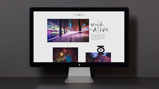
My particular love for this section of the lecture came from the design of the website - it's modern, sleek and captures exactly what the festival is about, using the hand made font clashing against the modern smaller typeface used for the lengthier descriptions. Because they've made a story behind the festival, it's really enticing to see and is so interesting for me, as a designer, it looks so simple but works so well.
