Showing posts with label process and production. Show all posts

Saturday, 23 April 2016

Intro Cinema 4D

In one of our last introduction sessions with Stephen, we were given an intro to Cinema 4D, a software used for 3D animation which is meant to be intertwined with After Effects.

At first were were shown examples of how the software can be utilised, from professional people to more simplistic designs that we ourselves were capable of recreating. I really did struggle with getting to grips with Cinema 4D, as the interface is completely different to that of any other software that I've seen. However, I found the work shown to be really interesting and enlightening to the capabilities of how clever Cinema 4D can be - it also made me realise how, when intertwined with After Effects, the work produced could be at a professional level, something that I'm looking to re-create myself.

We looked at the tools of the programme - this, again, proved quite difficult for me as I struggled to get to grips with remembering what each tool was for, although generating shapes by using the top tool, and scrolling along the design board were things that I could pick up, and proved quite easy to get to grips with, some things that were more about editing the shape and even creating the animation itself just confused me at the over-complexity of the software, which I didn't like at first.

I struggled to get to grips with Cinema 4D in it's entirety, I think after a lot of practice and playing around with the software, which is what I normally do to get to learn a software, will prove better and mean that I can experiment and play with the software at my own designated pace and can discover things we were not taught in the session. Overall though I was really impressed with the work shown in the session and some of the things we could produce very quickly, although I still believe the tools are hard to get to grips with.

Thursday, 17 March 2016

After Effects: Final Project


For our final project of the year from Sara, we were set a collaborative task to put together 22 videos all made by each person in our class, which, when played together, would show sea creatures swimming in and out of the frames and would make one consecutive piece. Since being absent from the character After Effects project, I initially struggled with coming to grips with making my animal have individual layers on a PSD document. I chose an Axolotl - thinking this would be easier to do as it just swims along. I use block colours and went over a base image in Photoshop, separating out each layer.

I learned throughout the entire process to make the image as simple as possible, as I found it really difficult to subtly move the legs without showing where I'd cut around the older image, so it didn't look quite as realistic as I intended - I chose to make the animal blink, and instead worked on things that would make the piece more realistic instead of re-doing the animal; this involved me generating bubbles on After Effects and using a layer to create the light shining into the sea. This made the whole piece a lot more realistic.

When creating the moving Axolotl, I chose to create something very fluid and give the animal some life by making it move, the animal needed to be "scared" by something because of the jerky movement half way through. I then created more bubbles to generate, and added fish quickly made in Photoshop and used key frames to move it along.

Overall, this utilized all the skills I've learned in After Effects so far, it didn't take as long as initially expected, so was able to add a lot more effects and spend more time focusing on the smaller details. I'm quite pleased with how it turned out, however I probably would have used more detail on the animal itself and fixed the issue with the legs not being able to move as far as I'd have liked, as he looks quite still/frozen. The overall presentation at the end was really interesting for me to see as it was nice to see everyone's styles come together.


Thursday, 10 March 2016

Physical Process: Typography 2

My next typography session was going off from the last session we had, focusing on creating my own typeface. As I discovered in the previous workshop, my typeface had to be as minimal as possible to prevent it from being over complex and unable to be read.

Whilst I coloured my original alphabet idea - the monuments, I concluded these would be too difficult to make a full alphabet out of, although the idea behind them I liked, they were quite difficult to make out the actual letter shape and took a considerable amount of time to draw out. They would be perfect for a presentation or something to "promote" the monuments, but concluding the amount of time I'd have to focus on the alphabet, I decided this option wouldn't be best in a practical way.

I instead came up with a few other ideas - to do something based on my interests, or something that I'd liked - a cat. I'd be able to create the animals leaning over, arching their backs or using more than one to create the shapes that I desired, and if I kept this as minimal as possible then it would be much easier to draw and create.  I also liked my original idea of creating a font that would cohere to the block layout of grid paper, each one fitting into one tiny block. These looked quite futuristic, using straight lines to join the letters together.

Overall I'm happy with how the letters came out, whilst they're simplistic, they're also quirky and something I enjoyed drawing, especially the cats as it was quite challenging to draw them in different styles whilst retaining a bit of character to them.


Friday, 12 February 2016

After Effects: Camera Positioning

My next workshop with After Effects took our skills to more of an advanced level; namely, we worked on generating the effects we created in previous lessons and stylizing them differently and making them look more complicated. In this lesson was the focus of using the camera tool to have the text/or other objects zoom in or out, move to the left or right, giving more of a 3D definition to the work than before.

We learnt how to use the camera tool on individual layers - by making them 3D objects by clicking on the small box near the 'fx' option, it would allow only the layers that were selected to be effected by the camera. You can also edit the amount of cameras you can have and create them on separate compositions if you want to overlay them all.


Inspired by Troye Sivan's "Wild" lyric video which involves yellow petals falling down on a cascade of lyrics, I took his other song from his new album, "Talk Me Down" as the pace was a lot slower than wild and I could work on using the camera tool at a slower pace. The intro and petals were created using the generate tool, and then I used an separate camera to make it sweep in at the end. Instead of changing the colour on the same layer I just duplicated the petals falling and changed the colour so they could alternate colours in a more slower transaction than sharp colours, which is what I envisioned more when listening to the song.
The colour changes are inspired by the video too, and work well together.
I also wanted to alterate the camera position on the text, so created that as a 3D layer and pulled the 'Z' axis on the camera forward so the text would jump out. When using the camera positioning tool you have to reset it otherwise it'll remain as zoomed in as you want, which I didn't want for the next layer.
Over all this was a really simple process but worked so effectively at creating what I wanted, although it took a while to get the hang of I now use the tool a lot and value it as it brings something else to a video which would otherwise be quite 2D.


Sunday, 7 February 2016

Physical Process: Typography 1

Our next physical process workshop focused on typography. The task was based around creating a character-inspired font using the letters ANESG, then, eventually, creating a full alphabet. At first I was completely stumped for ideas - I've never tried to create my own font before, and found it extremely hard to think on the spot, but whilst looking through videos of different fonts and designers, thought that making a more complicated one for the 5 letters would suffice.

I chose to base these around monuments - A around the Eiffel Tower, using the internet to research buildings that reflected each shape (S and E proved difficult to find any for) and lightly sketching out in pencil first. I wanted the outline only, as this would be more simple to use and to integrate colour into if made into a actual font. When I was happy with the design I used a black ballpoint pen over the top to enhance the details and create something that was more finalised.

This took a long time to come up with as a lot of the session I was researching and developing the correct monument for the correct letter - I don't think this would be part of my final design of A-Z as this would take too long to do and not enough monuments create an actual shape, letters like B, S, H, F and Z would not be easy to find monuments for as they don't make practical building shapes.


My second character design I want to focus on was quick sketches using my own hand writing, using it in a italic way, outlined, or in a cartoon style. These were meant to be quick experimentations to come up with a solid idea.

For my last idea, I came up with the idea of using cats as the character's for my font. For each letter, they would be styled in a different position, either asleep, with another cat, or just stood up straight. Again I wanted to keep this as minimalist as possible, to make it far practical to use. This was one idea that would take too long but worked particularly well, especially for the N as the cat was stretching. Overall, I would probably take the most simple design and develop this for my typography project.


Thursday, 28 January 2016

Photoshop: Introduction

In comparison to Illustrator, Photoshop works around the basis of layers - whilst this lacks in the compability to zoom in and re-size, as this is not a vector software, Photoshop allows you to create
non-destructive editing and create thousands of layers on-top of one of another. The best use for this is to manipulate photographs. In today's session we're looking at the non-destructive compatibility; and to create a self portrait.

Although my most familiar software is Photoshop, it was still an interesting session to watch as I learned about art-boards which I don't use as often, and RAW images which are non-editable flattened images.

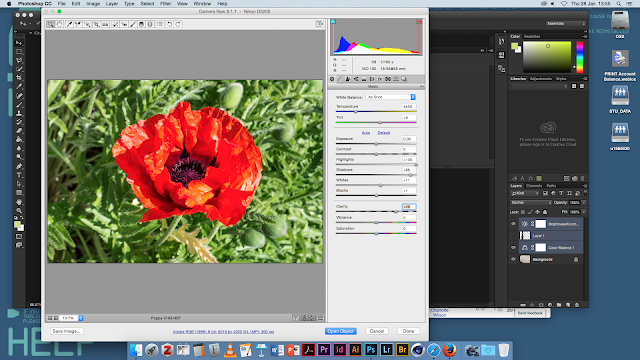
The majority of the session was touching on things I already new, such as layer styles which are used to apply over images. For example, darken is used to remove all white in the image leaving only the black, whilst screen does the reverse, creating different effects which I applied to my self portrait. We also learned about Camera RAW, a non destructive photo editing tool which provides information about the camera precisely and means you're able to brighten/modify the image without actually changing the original form.

Our project for the workshop was to create a self portrait. I touched back to my photography roots, overlaying photos from places that I've been to and lived by over a photo of myself. I used layer styles and non destructive editing by creating lots of different layers, so I could make very subtle modifications. The branches/trees were overlayed using the screen layer style, giving the edges of the picture of me that of the photo. I also used adjustment layers to modify the colour and textures of a blueprint to make the portrait more interesting and textured.

  • PNG = Portable Network Graphic
  • JPG  = Joint Photographic Experts Group
  • GIF  = Graphics Interchange Format


Throughout the session, Stephen showed us dual tone images. This was a type of layer mode found under "Image > Mode > Dual Tone" and required a black and white canvas originally. It was a tool used in printing and meant we could create two different colours, similar to a black and white style, over the image. The modes menu also allows options for different printing styles such as CMYK, RGB, Grayscale and more. This tool allows quick interchanging to them all.


Adjustment layers were also touched upon, although I'm extremely familiar with this. I used them in application to my own self portrait in a non-destructive way, by applying them over the top on a seperate layer and not to the image itself. They allow modifications to colour, brightness, vibrancy etc and are useful in creating images to a certain colour palette. 

In summary, although I've been using Photoshop for quite a long time, and this introduction proved really easy for me, it was still nice to strip back all the tools and focus on the simplest ones, as well as learn more about Camera Raw - which I'd touched on in photography. I'm quite happy with my portrait even though it's simple it works well using non destructive tools.

Thursday, 21 January 2016

After Effects: Kinetic Typography


Our next After Effects workshop was on the focus of typography. The brief was to bring in a font and information regarding the font; I selected Coolvetica, a spin on the font 'Helvetica', which is more rounded than the original. 

My focus was to try to be creative with my simple font, I chose to create an effect where the font looked as if it was being typed out simultaneously on the video - this was created by me manually changing the timing on each letter and moving the line along to create the effect of someone typing. Although it was a little tedious, I think the effect of the typing worked really well, it can also be improved by adding audio of someone typing along to it.


The next thing we were taught upon was to change the way the text transitioned in the beginning. Through using the CTRL button we were able to easily navigate around the time line, and using the position tool (by holding 'P') able to create time stamps of where the text would come from. By changing the position along the timeline, I could make the text sort of fly in different directions, which I did different ways for different effects. 

By having it come in different ways for the '1970' text, it created the appearance of "rolling in" - additionally, by using effects on the movement, such as blurring, it made the effect look like it was coming in more quicker and helped to support the rolling appearance.


I wanted to keep the focus intentionally on the font transaction, so chose to keep the colour scheme predominately black and white with a hint of blue colour. I kept the background also simple for this reason, choosing block colour over more complicated graphics.

From being my first attempt I'm quite pleased with how professional it looks, particularly with the font I chose and being able to learn heaps about text transitions that are quite easy to do. If I'd have gone back to improve, I would have made more complicated effects and made it look more visually interesting by improving the textures/background. Overall this session was really interesting for me and I learned a lot, despite taking an hour to work on my own thing.


Wednesday, 20 January 2016

Introduction to Illustrator

Our next software to look at was Adobe Illustrator. Although I've looked at the software before, I still struggle with some of the tools and getting to grips with the software, which is why this session was quite helpful to me, as it helped me learn the basics. Our task was to create a image traced picture with custom logo type; something that I've already done before with hand-drawn images to turn into vectors for different projects.


Although a lot of the tool's were similar to that of Photoshop, tools such as the pen tool, slice tool, eraser and image trace were a lot different in comparison, so it was quite interesting to see the difference between the two - I'd think Illustrator is more of a companion to In Design than Photoshop is to After Effects, so once compared with that it was easier to see the likeness.

For my image trace project, I wanted something that was similar to my interests, so chose a fox to trace. I selected many different options to get the one I desired, and then added the text to the side to give the tone to the piece - the text used was a font select purposely for the image to give it a more comedic tone to it.

I'm quite happy with my first lesson in Illustrator, I learnt a few things that I never knew before and although I've never really liked illustrator it was nice to get to grips with it and learn a few different tools and overall feel a lot more comfortable in it.

Tuesday, 12 January 2016

Physical Process: Object Drawing

For my final physical process session, the focus of the afternoon was objects. Much to my dismissal, we were tasked with drawing from observation with as much precision as possible. Previously in my other drawing sessions I was much more able to do free, less-precise drawings as these were easier for me to do and required less planning, so I was able to create more colourful pieces.

Although at first I did struggle to approach the drawings, trying to plan out the lines, I found that if I quickly sketched out the drawings and then went in with more precise lines this was a better way of me approaching this because it allowed me room to mess up.

On my first table were letters of different sizes and shapes, all 3D models. Although I only had to select one drawing to use perspective lines from, I started using this to get a grasp on the distance between the two letters I'd chosen and the different heights. As what usually happens, I always seem to run out of time as this is a lot longer process than I thought, I again used markers to keep improving my skills - it became a lot more easier to use than last time, quickly I learned how to create a gradient effect. Although it was definitely not a perfect drawing I was immensely pleased with how it came out because of the time it took me to learn how to create shadows; I ran out of time on my last piece but wanted to challenge myself so started sketching out a more complicated design. The 'R' was done by layering up different shades of grey markers and overlapping them so they would blend together to create a seamless gradient.

My second observational drawing was a lot more about getting the perspective right than the last. Since I'd played around a lot more with my markers in the first drawing, I wanted to improve my skills in perspective - something I find I'm quite bad at. The process was a lot of trial and error on drawing the lines, I wanted to make sure it didn't look off and spent most of the hour doing this. Although it's not perfect I'm happier with the perspective on this one than my first drawing, meaning some improvement.

Finally, my focus for this drawing was detail and shading. Using the markers that I found, I tried to make the object almost 3D by using the lighter colours inside and working outwards, and focused on the detail of such a simple object - a plug. Ideally I'd have want to spend more time on the perspective as I think this might be a little off, but drawing this from free-hand was something I was quite happy with.

Overall I'm quite pleased with how I've improved during the session, I learnt a great deal from trying to get the perspective right on things which is what I struggle with most.


Thursday, 3 December 2015

InDesign: Interactive PDF

Continuing on from our previous In Design session, we looked at some of the different features that the programme can offer in terms of creating something that could be more interactive. Initially, I found this a struggle to get my head around, as this required a lot of trial and error originally, but once I got the hang of it it seemed simple enough to do.

Our first section of the session allowed us to go back and re-do what we've previously learned. This meant that we had to adjust preferences for our document, learn about paragraph styles, which enables us to keep the same text preferences and paragraph preferences for each font, making it far easier to switch between two styles in comparison to other Adobe Software. 


We had to re-create one of the album covers selected from a PDF, I chose "Pervasive Percussion" as it seemed the easiest to do and the buttons were easy to design. For the workshop, I learned how to use colour swatches to save current pieces of colour I'd previously selected making it much easier to keep to a colour scheme, and how to select a colour from the image and not just from the hex code sheet. 

Using the align palette, which is used to align objects spaced around each other properly, I was able to match the circles up precisely to the album cover behind it, making sure the space was an even a mount of pixels between each other. This tool would be particularly helpful for a lot of objects that needed grouping together or anything that required precise measurements. 


Using the rectangle tool, we inserted "Swing of Change" - an animation - into the document. Although seemingly simple enough, this was a bit difficult as the individual video and frame move separately, so it was difficult to align without breaking this on the PDF. We were also able to modify the video so that it was interactive inside the PDF, the user could pause the video or adjust the volume.


The final thing in the session was to save this as a PDF and import it to check for any errors. I had to do this several times because I wanted to perfect the alignment of the text. Using the buttons to navigate around the page spread was quite a simple process, the "text" acted as a way of navigating around, by making the button a link to the text - not the page.

Although this entire session was quite a struggle for me to keep up with, the satisfaction of finishing this and actually producing something that was successful was ideal at showing me that I can learn In Design, despite at the beginning really struggling with it. Although it's not perfect I'm quite proud of how the PDF turned out.

Wednesday, 25 November 2015

After Effects: Speed and Motion to Character

The next After Effects production session was one that I'd really looked forward to. Our task was to create a character, in illustrator or photoshop, retaining the layer and layer sizes and then import the character into After Effects. We'd then proceed to animate the character, around the legs, face, tail etc or any parts that would make the character 'come to life.'


I chose a flamingo trying to keep it as simple as possible. Although I thought I'd selected quite an easy animal, when animating a 2D object it can prove quite difficult - we first had to make sure we'd keep the layer options and draw out each body part in separate layers, so we could easily animate each object without having to go through the process of destructing a flat image; I named them to make it easier on me to know which one I was animating. The process of importing the image was easier than I'd expected, we just had to select the option to retain the layer style.

I came up with many different obstacles when trying to animate my animal. Firstly, when moving the legs in the slightest way, it would show the gap where I'd tried to cut out the leg quickly, meaning that even the slightest movement exposed a gap in the leg of the animal, so the leg would have to be animated either very quickly or to not much of a big degree. The second thing was making the animal look realistic in its movement, depending on which animal would depend on how it would look when moving, so I had to research this in hindsight to make sure I could move the legs without it looking too stiff. This was one of the harder challenges for me, and although it's not perfect, I tried to make the animal look its best without revealing any gaps or errors I'd done.

Overall, I was really pleased with how my character came out, although really not perfect, it was nice to get to grips with animating different sections of the same composition, and bringing to life a character which I could use in later projects throughout my course.


Saturday, 21 November 2015

Physical Process: Interior Drawing


For my next drawing session, our focus was to look at the interiors of the Creative Arts building. I worked upon drawing with different marker pens to make the look more abstract, instead of going for a realistic approach - I'm not confident at drawing realistically so aimed to go for something that was a bit more unique and different.

For the first drawing, I opted to layer up marker colours to try and gain the look of the sun going down and the clouds getting darker, as well as the tinted windows; so I opted for different colours of marker pen and used two complimentary colours so they would fade together better. This was good practice for me as I've never used the markers before. The studies took longer than I thought to begin with as I had to layer a lot of them up with sharpies, fineliners and add colour and detail to them.

For the second drawing, my idea was to use marker pens that were contrasting (yellow and pink) to make the piece more abstract. I prefer this to the first drawing because of the minimalist use of colour I've used - it was much more of a challenge for me in terms of perspective and trying to create a vanishing point, as well as the smaller detail in the lights.


Layer adjustments to painting

My final drawing was done as a digital painting - I selected the best photo I'd taken from my phone and used this as a base to create something slightly abstract. By layering gradient maps and inverting colours, the effect in the painting was something similar to my original drawings - I didn't like the idea of making something accurate, as this is not what I'm best at doing. 

Although not as neat as I'd intended it to do, I prefer this as this creates a more abstract feel which is originally what I intended to do. I kept the detail to a minimal and focused more on the colour, creating a certain mood about the building which was captured better in this in comparison to my drawings. I definitely feel my advantages lie more in painting with my tablet (a Wacom Intuos) my aim was to use two colours opposite each other on the colour scale: I opted for a red and then mint green to highlight, creating some depth to the piece. This was one of my favourite things to do in the process drawings as it was something a lot more familiar to me, and, in my opinion, something of much better quality.

I would definitely look at using the same or a similar technique for my next drawing session; allowing me to further practice my digital skills and create something more similar to what I originally intended - it's far easier for me to create something of better quality, although I also want to practice my observational drawing skills so intend to keep drawing as well.


Friday, 13 November 2015

InDesign: Double Page Spread

For my second InDesign project, we looked at re-creating more complex layout spreads and using our own images (such as from bands etc) to create a response to this. Initially, I really struggled with keeping up with the pace that was required to keep moving on with the posters, especially during the In Design sessions.

The software proved difficult to get to grips with, and eventually I took it to myself to take a break from it and come back. My response was to re-create the second poster given, and I changed this to be inspired by Harry Potter. I used a found texture from website and used the grids as references for aligning up the type.


I really liked the outcome of this, although so simple I tried to keep to using the grids as much as possible; meaning that the text wasn't out of place nor over complicated.


We were taught how to create Text into it's own editable vector, making it easier to expand and be more creative with text and the layout, shown above. This is such a simple technique but creates more of an interaction between the text and a layout, allowing it to be used for a border or to make the layout more aesthetically pleasing.

Thursday, 5 November 2015

Workshop Week


Our workshop week was open for us to be able to for one or two days start and finish an entire project. I selected Wednesday's workshop session with Sara, creating an motion graphics Christmas Card with other people to place together in harmony for a video for the university.

For my card, I wanted to do something that was more personal to me, and to show off my skills in Photoshop. I took about making the card very complicated in design, in comparison to other people who stuck to making the animation more complex; My initial planning was to create something with subtle animation in, such as snow falling or the breathing of the fox I incorporated.

Although I wasn't able to finish this due to illness, I still really enjoyed the project and the start I made to it, I was inspired through pinterest ideas and my own likeness for things to create this. My idea was to create a few different frames and animate them subtly on after effects, possibly focusing on the text, fox, and some snow that I would add, as this would work better for my design than anything else.

Friday, 23 October 2015

After Effects: Novel 2


James & The Giant Peach

To conclude my introduction to After Effects, I finally placed together my frames from Photoshop into After Effects, a software I was completely new to.

The introduction to the software proved quite time consuming as I'm quite used to using Photoshop and image editing software, the comparision between the two was hugely different to what I was used to. Although I've experimented on Premire Pro, Movie Maker before, a lot of this was trial and error, as seen in my video.

My overall reflection of the video I created was that as the video progresses, it does develop in skill. My expectations of myself, and thus the video, meant I was required to Google search a lot of the steps needed to progress in the video. An example of this can be seen in the "a novel" section - I wanted the transaction between frames to be smoother and at a quicker frame rate, so I took about learning how to use effects (CC Wipe etc) on my own and how to apply them. This also granted me access to a lot of shortcuts, such as pressing "T" to view Opacity levels on each frame.

This took an incredibly long time to do, as we also had to get to grips with completely new software and produce a ten second video with audio. I obtained audio from the Youtube Audio Library, which provides free copyright audio; I sifted through to more positive/upbeat audio to reflect the novel and it's upbeat pace.

The video itself I'm not entirely happy with, however for the first attempt I feel I've learnt a lot from researching and listening to Sara. It's not 100% perfect, with particular focus on at the end, but I also took a lot away from the session and introduced myself to After Effects.

Thursday, 15 October 2015

Physical Process: Location Drawing


For our process and production session, we explored around Huddersfield town and practiced our location drawing skills. Whilst this was not related to the course, it was nice to do something similar to my art foundation routes, and going around and exploring using perspective was good practice for me - My biggest problem is not being able to work quick enough and struggling to submit anything that isn't perfected.

These were drawn in quick time segments and whilst I kept abandoning a lot of the sketches to start out with, I was quite happy with how some of them turned out, mostly because I don't think I'm that good of an artist. My particular focus, on the LLOYD's logo and horse, stood out to me because of the way I've filled in the logo using small sketches/etches from a fine liner. 

I particularly struggled with getting the perspective right, this was hard for me because I couldn't always do this as quickly as possible and ended up rushing a lot of it. Although rushed, I am quite happy with the outcome, and attempted to trace sections of my work using illustrator. 

Finished Page

Thursday, 8 October 2015

After Effects: Novel


As an introduction to After Effects, we explored From Form - a design studio who makes short films and motion design. Their video was filmed using both digital and hand-crafted work; the transactions were eye-catching, colourful and humorous whilst getting to the point.

 For our own project in After Effects, I chose the novel James and The Giant Peach, by Roald Dahl. The aim was to make a 10+ second clip using over 10 frames for a short summary/intro to the novel. Created in Photoshop, I focused on orange as the primary colour. My focus on transaction effects was for them to be quite choppy and relevant to the novel (the peach and the ladybirds across the screen),

Saul Bass's Posters

My work felt very similar to Saul Bass, who was an graphic designer most famous for this style of work, which was based around silhouettes and simple, colourful layouts. The minimalist style is still eye-catching and Bass used shapes and text in a creative way which would clearly display the plot of the film. After I'd researched him, I decided to incorporate this into my work, by adding textures and playing with layer styles more.

InDesign: Intro Poster Task


Today we were given an introduction to InDesign; a Adobe software used mostly for print publishing and for its clever use of master pages to create a consistent layout.

 We were given the basics on text, pen tool, shapes, colour, gradients and grids. Although a lot of this was similar to Photoshop, it was beneficial for me because of the re-explanation of some tools and the grid introduction. It's similarities in Photoshop meant I didn't feel too lost in re-creating a poster, as such, I decided to go home and re-create my own using the information we were given this afternoon.

 InDesign makes it a lot easier to create a layout which requires a lot of measurements and alignment (for example, the poster I had to re-create needed the grid to align the text)
I was quite happy with the product, although surprised at how long it took me to re-create the poster. I especially liked the simplicity of it, such as the use of negative/blank space and the block of rectangles representing volume on a stereo. It's simple, but very effective.