Showing posts with label typography 2. Show all posts

Wednesday, 16 November 2016

In Design: Posters


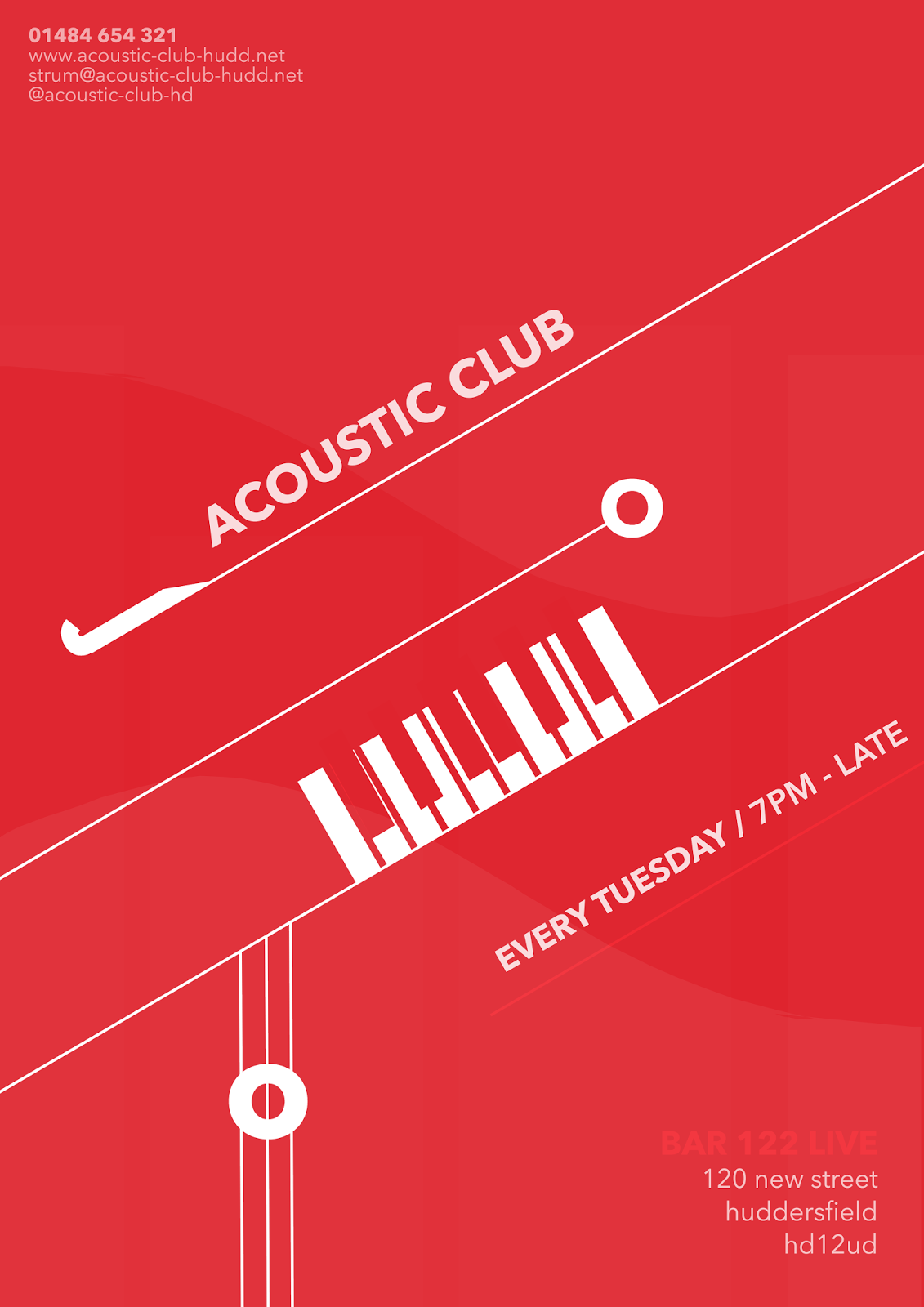
My next In Design session with Aidan looked at creating posters using a limited palette. Specifically, we were limited to using text only - no images or anything from Google. The first poster I looked at I found quite easy to create; Acoustic Club. I started by sketching up any ideas I'd had - the poster was to create something that was for numerous musicians and not just a set of one person, so I chose to create instruments from a typeface that related to many different musicians. Again, our colour palette was limited - we weren't to focus on this, instead the position, font face and size that created the poster.

For my first poster, 'Acoustic Club' - I looked at creating something that easy recognisable to musicians, but to entice different types of musicians - for example, I used different text such as 'O' 'I' and 'J' to create different instruments without using already pre-made images. I found this to be quite easy to do with music, but as each poster had a different meaning later found it quite hard to create something I'd like. The Acoustic one was one of my strongest posters; I feel it created the exact mood and intention
for the club and was also one of the easiest ones to associate with what it was created for.

The next poster was the 'Craft Beer' - This was a lot harder than I thought and overall I'm not too happy with the outcome, I want to go back and improve it. The idea behind this one was to have the text sat in-between a beer created out of shapes on Photoshop. The colours I feel work well, but not for the beer feel - though I've tried to make it look as professional and modern as possible, using the same font before and making it look as if the B in Beer is a beer glass. This way it's still associated with the topic.


Overall I did like this workshop, though found it really tested me. I did like coming up with different ideas but it proved difficult to limit myself so much, but found that I could still create something that I was happy with (especially with the Acoustic Poster) so it was still nice to create work that I was proud of, even though I didn't think I'd achieve it. I'd still like to go back and improve some posters as I feel they don't look as great as the first one, and don't look 'creative' enough for me.


Wednesday, 19 October 2016

Physical Process: Typography


The next workshop with Nick explored the use of typography. For this session, we were given several fonts to cut out and create posters from; this could be sayings provided or we could make our own up. For the first poster "WHAT DO YOU MEAN!" I chose to stick with the sayings provided with us to get into the flow of creating posters. Again, with Nick sessions, I love the relaxed, drawing and cutting together idea behind the workshop. It really made me explore my ideas and come up with things that I was actually proud of doing - even though I'm more inclined to work on the computer, it was nice to spend an afternoon cutting out and working out what would look the best.

In this workshop we were to consider kerning, typeface, position and the use of uppercase and lowercase. Looking back on what we learned at Aidan's session, I tried to take this into this workshop by considering the positioning between each letter and tried to keep them as
minimalistic as possible. I also tried to take into position the use of uppercase/lowercase, as the word flows better in all the same style.

I loved this workshop, it was so much fun to come up with sayings to create as a poster and particularly just focus on positioning and font style, stripping back to basics and looking at what looks good. In response to the workshop I tried to re-create the posters I'd done and add colour, texture, keeping to the minimalistic response but trying to add a "pop" of colour. I chose to make the "WHAT DO YOU MEAN!" poster like a speech bubble, as it's a direct quote from a song.


Wednesday, 12 October 2016

Typography

Our first process and production session back with Aidan was to explore and introduce back into typography. I'd never given much thought about kerning, tracking, etc; all the things we'd learned into the lesson and it was nice to give more detail that I'd usually do to type. The session had already been touched upon in last years workshop week, so I found the session especially relaxed - it was nice to play around and experiment with different words and not have one final outcome.


The first task was to explore kerning and tracking, specifically, the gaps between each letter and how this would effect the overall 'flow' of typeface. I found it quite interesting to see how based on how each letter is to one another would effect how the overall font appeared, especially when closing the gap between the L and A in 'claws'.  This was something I'd never considered before and can be taken away from the session when exploring type.


Our next task allowed us to explore text even more in a personalised manner, given any letter and to see how illegible, or not we could make a typeface. I chose a C to begin with but opted out after realising it couldn't be manipulated as much as other letters. The way the font face, and using shapes to cut through the type making it barely recognisable was quite clever - for branding especially it would be a good way to stylise something from modern or not.

The typography session, although I'd done before, I did really like because it was more refreshing to have a relaxed session compared to being overwhelmed with information. By giving us a lot of time to experiment with type, I could refine my ideas and expand upon what I'd learned in todays session (especially with kerning and type to make the word seem more put together) 


Overall, I really really liked this session. It was a nice change to do something so relaxing and to consider type in a different perspective from colour or font-face. I'd love to do something like this again so I can consider adding a typography project into my work.