Showing posts with label sketchbook. Show all posts

Thursday, 10 March 2016

Physical Process: Typography 2

My next typography session was going off from the last session we had, focusing on creating my own typeface. As I discovered in the previous workshop, my typeface had to be as minimal as possible to prevent it from being over complex and unable to be read.

Whilst I coloured my original alphabet idea - the monuments, I concluded these would be too difficult to make a full alphabet out of, although the idea behind them I liked, they were quite difficult to make out the actual letter shape and took a considerable amount of time to draw out. They would be perfect for a presentation or something to "promote" the monuments, but concluding the amount of time I'd have to focus on the alphabet, I decided this option wouldn't be best in a practical way.

I instead came up with a few other ideas - to do something based on my interests, or something that I'd liked - a cat. I'd be able to create the animals leaning over, arching their backs or using more than one to create the shapes that I desired, and if I kept this as minimal as possible then it would be much easier to draw and create.  I also liked my original idea of creating a font that would cohere to the block layout of grid paper, each one fitting into one tiny block. These looked quite futuristic, using straight lines to join the letters together.

Overall I'm happy with how the letters came out, whilst they're simplistic, they're also quirky and something I enjoyed drawing, especially the cats as it was quite challenging to draw them in different styles whilst retaining a bit of character to them.


Sunday, 15 November 2015

Proposal


My proposals for part two of my project were mostly similar. My main interest was space, which I valued as an 'underappreciated' part of society, I wanted to highlight this in a way that was my style. My ideas relied on using Photoshop/online software to create something that would present data found in space in a visually pleasing way, particularly things that I would find valuable or interesting - my target being the wider public, maybe as a wider campaign to get people more interested in astronomy.

1 - Infographics in Space
A visual represetation of data to promote the discoveries in space; an underappreciated section of our world. Use to make data more visual and eye-catching to our broader society in a campaign to make us more aware of the area out of Earth

2 - Motion Graphics
A visual representation of space, data and information prepared for motion video, web or graphics makes data look visually beautiful and allows full exploration of data. 

3 - Self Portrait Map
A map, taken in the physical or literal sense, to express or explore my personality in its enterity. Visually explain self through graphics as a whole, including life, friends, family or interests. 

4 - Social Media
As something we do not value as society enough, Facebook has over 1.7 billion users - at least 1/6th of the global population. Explore and present either a personal response or not to this, wether that would be motion graphics or design - social media is a huge way of communication and a way we express ourselves openly online.

When creating the proposals I wanted them to look like a live brief - the words were chosen so it would look as if someone had given me the idea to respond to. I chose the first (Infographics in Space) proposal, this was the one that I could see myself doing and had the most research in my sketchbook to back up my work. My ideas were already in my head for what I wanted to do: create posters, possibility animated, that would re-spark the love of astronomy.

Initially motion was my focus of interest, I opted to present my pitch as a work book with pages of development in - having been told by John that it would be better to pitch with different designs, this was my reasoning behind it. Overall I'm glad I went down the workbook route as this makes it easier and more creative for me to present a few different designs and to just animate one poster, this would make a more interesting pitch than just going behind one set layout.

Monday, 2 November 2015

Artist Research: Constellations


My focus for space was on Constellations. Although seemingly not that important, my idea was to concentrate on using Constellations as a way of presentation and for looking at layout styles, as they're simplistic but effective at presenting information.

An example is above, a project from Second Story, a company who at a event for Engineers created a way of allowing them to rank the most important topics to be discussed, by using an interactive mind map that allowed their names to appear on the info-graphic and be presented out onto touch screens.

This way of presenting data in a way that wasn't as boring as usual was something that I wanted to focus on. By using constellations, something that I initially researched in space, it was a way of combining the two together and creating something that was visually stunning to look at and also a way of getting the company to interact with one another, as this was a way of talking. The work was hugely influential on me because of the style of doing this; if I were to re-create this idea I would use after effects to generate points that would move around, similar as shown in the video.

Thursday, 29 October 2015

Artist Research: Linkin Park


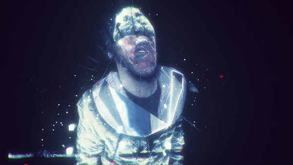
Waiting For The End is a 2010 music video by Linkin Park for their 4th album, A Thousand Suns. The video is an experimentation of composting, animation, 3-D tracking and design by a company called Ghost Town Media.
Screen Shot Stills

The video is created using a layered effect by putting the clips through several times into software, to get the broken look and the "burst" effect from the video. The blue-hue toned colour is then placed over the top finally. Sytheneyes is used to attach objects to the band members, particularly the 3-D enhancements and geometric lines.

I selected the video because of the special effects used, they remind me of constellations especially in the way the geometric lines pan out across the band members; I wanted to re-create this for my own work, possibly looking at doing something similar for photographs or a map of myself, looking at Grayson Perry for inspiration. 


Similarly, Gabriel from itsknowone, created and collaborated with Ghost Town to create the SFX for their concerts for the A Thousand Suns Tour, and the video. Although they don't align with the music, I like the broken effect from them and the repeated use of overlapped videos. Gabriel has also worked alongside Marvel for the Captain America videos.


https://www.behance.net/gallery/29303105/Linkin-Park-A-Thousand-Suns-2010-Tour
http://itsknowone.com/70843/6061899/selects/captain-america-winter-soldier-feature-film
http://www.motionserved.com/gallery/925204/linkin-park-waiting-for-the-end

Tuesday, 27 October 2015

Sketchbook: References


  • http://www2.astronomicalheritage.net/index.php/show-theme?idtheme=17
  • http://space.about.com/od/astronomyspacehistory/a/timelinec.htm
  • https://en.wikipedia.org/wiki/Constellation
  • http://www.slac.stanford.edu/econf/C0908211/pdf/talk09_vulga.pdf
  • http://www.impawards.com/designers/ignition_print.html
  • http://www.artofthetitle.com/title/the-last-of-us/
  • http://www.worldofmerix.com/

Tuesday, 13 October 2015

Sketchbook: Space


For my sense of place, I wanted to expand upon this and not stick to anything on Earth. I decided upon space, as this something, in my opinion, that we rely on far too much and don't appreciate it. My means of research were to look into the discoveries in space and try and create some form of visual representation of portraying it, maybe an info-graphic or a mind map, that would display information about space or the most important discoveries (Water on Mars etc) but would be something that would be much more than just a list. I wanted to focus heavily on the fact that this information may not be the most interesting, and how I would go about making this interesting to look at and read.

Space was something that was quite hard to narrow down; the amount of information we were provided on Space meant that trying to focus on one section was hard, I tried to come up with the most pivotal points for space and focus on our own solar system to make this easier to research. My focuses were on constellations, discoveries in space and any graphics that would relate to space.

I also took to researching films that were featured/relied on Space as it's setting: Interstellar, Gravity, Alien and WALL-E were points that I looked at - I wanted to also look at the graphics/fan art inspired by the movies as a way of researching them, I loved looking at the minimalist posters and ones that told the narrative in a way that wouldn't spoil the movie.

Overall, my ideas for Space were to present some form of timeline, info-graphic or video that would promote more awareness of space and the discoveries around it, I liked focusing on simplistic graphics and constellations as a way of making my work look the part.

Saturday, 10 October 2015

Artist Research: Grayson Perry

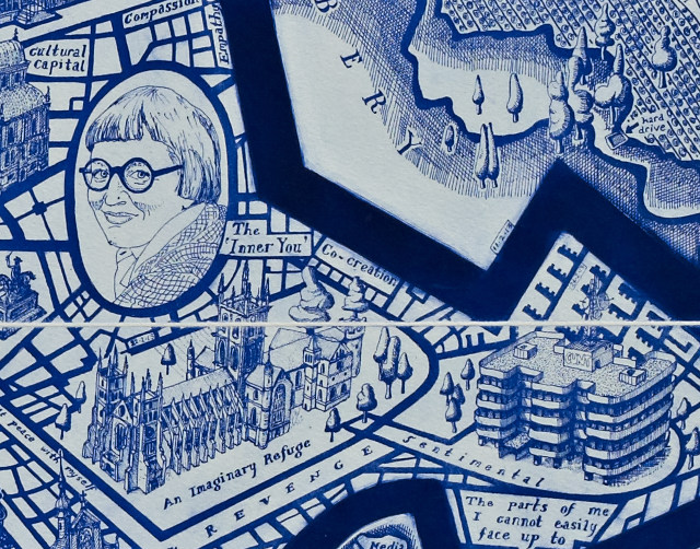
Grayson Perry - Map of Days
On my focus of maps, I chose to approach this in a more emotional point of view than the literal sense of the word map. By doing so, I looked at Grayson Perry, an English artist known mostly for ceramics. For a programme titled "Grayson Perry: Who Are You?", Perry met up with individuals across the country and decpited a self portrait of them; using ceramics, tapestry and painting to portray them - the idea was the "portraits" were not meant to be taken as just a drawing of themselves, but more of their personailties and traits.

His work is something that I've been inspired by, particularly his response to the map and how he creates his own interpretation of it - I would like to do something similar, maybe reflecting my life or including people in my life that branches off; I want to experiment with graphic styles or do something that requires a lot of time and effort, as usually I'm quite quick on Photoshop. I'd also like to possibly delve into making it interactive, or printing it off into a huge scale.

The Channel 4 Programme showed many examples of how Perry reflects a much more personal response to the work; his Map Of Days is a self portrait which shows street names coming off and important landmarks about his life, he writes traits about himself and the attention to detail is remarkable, shown below.


Friday, 9 October 2015

Sketchbook: Maps

Maps was one area of topic I wanted to look at in my sketchbooks. Maps, taken both literal and in the emotional sense, are a perfect example of Place: they guide us around our day-to-day-lives, and can also be interesting pieces of art work.

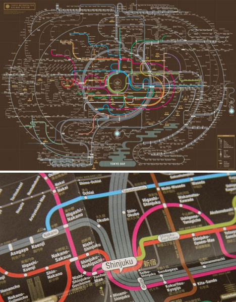
My possible idea for maps was to look into artists who make them more creative than just a informative object; I was looking to combine the information provided by maps and a graphic style that would be visually more interesting to look at. Pinterest was my main point of research, this granted me to access to so many more artists who use maps in unique ways. An example was Zero Per Zero, graphic designers who created colourful and creative ways of looking at metro lines across the world, such as Tokyo and New York. This was a primary example of my focus, because it combined beautiful graphics with information that was useful. If I was going to combine the two together, I would use this as inspiration, it's minamilistic and provides a lot of information without being too crowded.


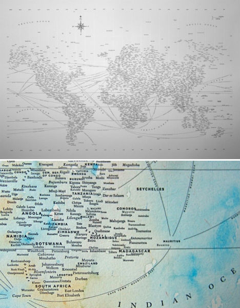
Typography in graphics was another area I wanted to look at. This was particularly minamilistic and, with the right font, looked beautifully designed - Nancy McAbe created a map of the world using typography, labelling each city in each of the countries. Whilst at first this is simple, the more you look into it the more interesting it becomes, as a lot of information has been packed into the map. McAbe also stats adding colour to create something that looks visually beautiful.

My ideas were to combine both information and emotion, as such I looked at Grayson Perry's work as I possibly wanted to go down the route of making my project more personal, looking at myself and researching graphic design styles to inspire me into creating a map that was both aesthically pleasing and something that was reflective of me.

http://weburbanist.com/2011/05/30/creative-cartography-15-artists-transforming-maps/