Wednesday, 26 October 2016
Cybernetic: Left Side Process
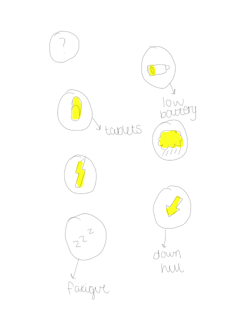 (1) The next process in developing my final piece was to look at the left side of my work. Because I'd done and completed one side, I needed to mirror the emotion, colour, and detail that I'd portrayed in my social media presence. I found this side more difficult to work with as it was about being honest in terms of the colours, shape and icons that I'd selected out. Because it was a personal approach to the project it was also hard to find the motivation to create the side that was more honest and to show that side of myself. (2) I chose to have black and white sort of envading the face of the left hand side as I believe not everything is directly one sided, it's more a mix of both sides. I also liked the way the black and white was more of a focus on the blue/grey palette I'd selected, and I wanted icons that portrayed that side of me. I did my research online into 'depression' and icons associated with this, coming up with sketches that I then placed into my work. It was nice to have a more honest side to myself and show the true side effects of depression in a more lightened view.
 Tuesday, 25 October 2016
Sunday, 23 October 2016
Friday, 21 October 2016
Presentation Development 2
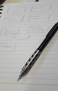
I started planning out what I wanted my PDF to look like. Because of the quick nature of the first presentation, I knew it only needed to be around seven slides long, so stuck to this to fit everything in: it also allowed me to condense my research significantly which kept me to my five minute time constraint.
Keeping each page simple would be hard, as I'd have to condense all the research into a few sentences and then elaborate for each page correctly. I found this challenging as I'm not used to planning out what I'm going to say, I find this is more difficult for me to sound professional and in the right manner.
The first page I'd look at would be to do with the BBC. I set up questions for each page to make the process of writing notes on each one easier.
BBC:
What is BBC?
Narrow down to the TV/modern era, specifically which channels. Brief introduction to the BBC
Ident:
What is an ident?
Examples?
How they impact?
Idents to the BBC:
How they are on BBC 1, 2, 3?
Why are they used?
Who makes them?
Trends of idents: Why they're changing
BBC 3:
Narrow down to the BBC 3 to indicate more research
Why they changed?
Move to online?
How do the idents reflect the target audience?
Branding of Idents:
How do they target their audience?
Or, not?
Reasoning behind why they're branded like that?
Does every ident do this, whats the most famous one? Why?
This would be my plan for each of my slides on what to answer and how to keep the subjects as narrowed down as possible. Specifically, I wanted to go:
Idents > Idents of the BBC > BBC 3 Idents > Target Audience of BBC 3
This would allow me to have a natural progression throughout my PDF, and make it easier for me to progress to each slide.
https://en.wikipedia.org/wiki/BBC_One_%27Rhythm_%26_Movement%27_idents
Thursday, 20 October 2016
Cybernetic: Background Design Process 2
(1) Following up my inspiration and design process from looking back into my research, I applied this to my final piece. Although I initially liked the broken up and "glitched" effect, it didn't seem to work with what I was trying to do, as well as this, it made the piece look far too busy. I tried the pen tool (finally) and tried to work some scribbles across this, to signify my creative side. The pen tool was something I'd never used before and was pleased with the outcome, so refined this to more imperfect lines and to make a bit more flowy.
(2) I removed the digital/glitch aspects from my face and then added more shapes, creating a "fox tail" shape to signify my love for foxes. Because I'd scratched the animal idea, I didn't want it to go to waste so tried my way of adding it in without making it too obvious. Another idea I had was having a fox coming out of the work. I altered the collar on my body too so it wouldn't direct the attention away from the iconography and lines swirling out.
(3) This is where my work was starting to really take place; added icons to represent my social media presence and correcting the colour. I also started on the left side of my face, which at first, was hard to do based on the angle, and it was hard to add the same attention to detail to the left side as it took so long. I was really happy with how my project was coming along.
Wednesday, 19 October 2016
Physical Process: Typography
The next workshop with Nick explored the use of typography. For this session, we were given several fonts to cut out and create posters from; this could be sayings provided or we could make our own up. For the first poster "WHAT DO YOU MEAN!" I chose to stick with the sayings provided with us to get into the flow of creating posters. Again, with Nick sessions, I love the relaxed, drawing and cutting together idea behind the workshop. It really made me explore my ideas and come up with things that I was actually proud of doing - even though I'm more inclined to work on the computer, it was nice to spend an afternoon cutting out and working out what would look the best.
In this workshop we were to consider kerning, typeface, position and the use of uppercase and lowercase. Looking back on what we learned at Aidan's session, I tried to take this into this workshop by considering the positioning between each letter and tried to keep them as
minimalistic as possible. I also tried to take into position the use of uppercase/lowercase, as the word flows better in all the same style.I loved this workshop, it was so much fun to come up with sayings to create as a poster and particularly just focus on positioning and font style, stripping back to basics and looking at what looks good. In response to the workshop I tried to re-create the posters I'd done and add colour, texture, keeping to the minimalistic response but trying to add a "pop" of colour. I chose to make the "WHAT DO YOU MEAN!" poster like a speech bubble, as it's a direct quote from a song.

Monday, 17 October 2016
Lecture: Buyer Behaviour
Our next lecture with Peter explored the behaviour behind the buyer; someone who looks to purchase products you're possibly marketing.
We also looked at Maslow's Hierarchy of Needs, which is something I've looked at previously. It's the idea behind that, what you absolutely need in life, from priority being the bottom to going up to stuff that is not a necessity; such as wealth, technology, etc.
Need Recognition
|
Search
|
Pre-Purchase Evaluation
|
PURCHASE
|
Consumption
|
Post Purchase Evaluation
|
Buy Again
OR
Good, OK, Bad, etc
The theory behind marketing is that if you understand the marketing aspects behind people, and who you're marketing too, that you're able to get into what they like or don't like, and make a more personal response for what they want out of it; so you're able to make a more personal sale to the person and thus gain more of a audience.
You: Exposure, attention, comprehension, acceptance, retention, <-> Memory <-> Buyer Behaviour Process <-> Environment, Culture, Social, Family, Class, Work, Ethics
We also looked at Maslow's Hierarchy of Needs, which is something I've looked at previously. It's the idea behind that, what you absolutely need in life, from priority being the bottom to going up to stuff that is not a necessity; such as wealth, technology, etc.
5. SELF-ACTUALISATION personal values
4. ESTEEM & STATUS power, respect, worth
3. BELONGINGNESS relationship, family, home
2. SAFETY shelter, defence
1. PHYSIOLOGICAL food, water
So the idea behind the Hierarchy is you can't advance up to the top of the needs without building on the beginning ones.
Which Product?
Memory
The first thing you'd associate when buying a product is something you've already recalled upon, but you have to consider whether this was a good/bad/indifferent association. Long term or short term purchase is also coming into play, usually if it's a longer term purchase you'd be more inclined to think about
Aesthetics
Reflecting your own personality onto the aesthetic to what you purchased, why you are buying what you're buying - to influence your friends, to fit it, or emotional response? You have to be in the right emotive state to buy something. Conscience, love, etc.
Gender
Genetics - men vs women. It affects how people approach, do what they do. Women are commonly associated to work well on their own, whilst men are known to work in teams more.
Other Views
Sunday, 16 October 2016
Cybernetic: Background Design Process
Since I was struggling with the process for the background, and what I wanted it to look like, I started to sketch out any ideas I'd had, inspired by my initial research. I expanded on the drawing I initially had of just one side of my face, to the entire piece, so I could clearly plan out what I wanted. Taken the colour research I'd looked into, I also created a colour palette to sort of follow for each side.
Keeping to the fox theme I'd gone through for my entire research, I chose to expand upon my original piece of work I did at the beginning of the project. In the same sort of style as my face, I added the background into it as a rough idea of what I waned the final piece to look like - sort of to plan out colour and shape. Because my first background idea didn't go well (or look what I envisioned) I chose to go back and look at my research and then respond to it:
I'm quite happy with how the fox turned out, the colour contrast shows also what I'm thinking about doing for my final piece, with the blue being the opposite of the yellow & pink. I added some 3d elements to my work to imply depth to the piece, which at first I wasn't sure about, but after editing and create a cohesive colour scheme I actually came to like. This led me onto the inspiration to start developing my background and making something that I was now, 100% happy with.
Cybernetic: Design Research 5
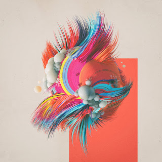 As I'd eventually worked on my final piece for the project, the face was something that I was settled upon looking how I wanted it to - however, I had to work on the background and start intertwining the ideas I'd initially drawn out from the beginning. I tried using basic shapes on Photoshop and editing them to give a 3d feel, but didn't feel this was enough to depict what I'd drawn out.
I then decided to do some artist research to gain some inspiration for the background and to start planning out what I wanted them to look like. Through research and Pinterest, I found Mike Winkelmann, a digital artist from America whose speciality is using Cinema 4D.
His work is really what I wanted to capture in my own, the colour schemes, abstract yet "computer-rendered" feel, and the use of circles, triangles, angles etc to give life to his piece. Particularly the middle work and the portraits are my main sources of inspiration. They're exactly what I was looking to depict in my own work, a mix of real life and cyber.
Although I can't create them exactly using photoshop, they're my main source of inspiration for the background, to depict the online reality of the world crashing with my own face to the right, and the use of colour is also what I wanted to take from his work too. Visually they're beautiful pieces and his use of shadow, lighting and colour make beautiful work.
Feedback
Prior to my previous feedback, I took onboard what Jay suggested and researched animals, moods and other styles of graphics that I found I wanted to incorporate into my work. This led me to look at several other artists I hadn't approached before, letting my work expand further.
I met with Jay to discuss a lack of motivation to do this project - it's particularly overwhelming to do a project based on yourself, and I found it hard to create the work I envisioned in my head. I did take upon the advise to do little samples of what I wanted the work to look like, doing a few of these and limiting myself severely to the time contrast, and although I wasn't happy with them, they did lead me to develop the main final piece I was working on.
The advise I was given was to create more development and experiment with my ideas a bit more, which is why I delved into artist research - I looked at artists I was inspired by and tried to be/create something influenced by them. I managed to do this for my face, however, as said in the previous post, needed something for the background so I could finally finish one side of my face and work on the next. Overall I was overwhelmed by the amount given to me but by feedback I could narrow down how to progress on the work.
Wednesday, 12 October 2016
Cybernetic: Development
Following up on the sketches I drew, I started working on what I wanted to be my final piece. My idea was constantly changing - whether to make two sides of my contrasting face or follow the animal mythology I'd wanted, and researched, to look at, to come out of the other side of my face. I thought for development it would be a good idea to sketch up both ideas - even though they'd take a long time to create. The fox was something that I felt may work more successfully then two illustrations of my face; but it was hard to relate it back to my 'online' self as such.
 Another point for development was the background. My face had been easy to create as I'd had direct inspiration for that via the artists I'd looked at, however the background was something that was much harder to make 'physical' and '3d' looking - I wanted it to keep in the same theme as my face, but also pushing my limitations and making it very detailed.
I really liked the style that was beginning to come through from this piece so far. The detail in my face is something that took a long time to do, however, looks great when zoomed in - the idea was that we are detailed people so I wanted to make something that when it was examined close up it would look well done.
My next development stage was to look at either the fox/face progression on the other side, or to work on the background that needed altering as I wasn't particularly happy with it. I wanted something that was more 'flowy' and detailed, intertwining icons from social media to portray my online persona.
Old photos of me I re-cycled to use in this project. These
perfectly captured the angles I'd drawn out originally, and kept
me in minimal make up so I could illustrate myself easier.
Typography
Our first process and production session back with Aidan was to explore and introduce back into typography. I'd never given much thought about kerning, tracking, etc; all the things we'd learned into the lesson and it was nice to give more detail that I'd usually do to type. The session had already been touched upon in last years workshop week, so I found the session especially relaxed - it was nice to play around and experiment with different words and not have one final outcome.
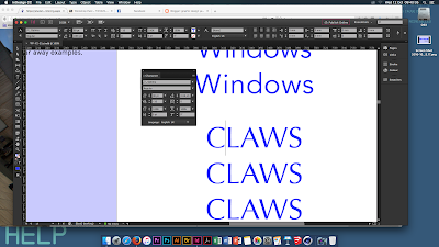 The first task was to explore kerning and tracking, specifically, the gaps between each letter and how this would effect the overall 'flow' of typeface. I found it quite interesting to see how based on how each letter is to one another would effect how the overall font appeared, especially when closing the gap between the L and A in 'claws'. This was something I'd never considered before and can be taken away from the session when exploring type.
Our next task allowed us to explore text even more in a personalised manner, given any letter and to see how illegible, or not we could make a typeface. I chose a C to begin with but opted out after realising it couldn't be manipulated as much as other letters. The way the font face, and using shapes to cut through the type making it barely recognisable was quite clever - for branding especially it would be a good way to stylise something from modern or not.
The typography session, although I'd done before, I did really like because it was more refreshing to have a relaxed session compared to being overwhelmed with information. By giving us a lot of time to experiment with type, I could refine my ideas and expand upon what I'd learned in todays session (especially with kerning and type to make the word seem more put together)
Overall, I really really liked this session. It was a nice change to do something so relaxing and to consider type in a different perspective from colour or font-face. I'd love to do something like this again so I can consider adding a typography project into my work.
Sunday, 9 October 2016
Cybernetic: Design Research 4
My next research progress involved me looking around the internet, pinterest, behance etc for some inspiration. Despite the project going far into experimentation and research, I felt it needed a boost for me to provide more work that I was happy with, so I decided to look more into images that inspired/motivated me to create the work I wanted.
This led me to an artist called Giamoco Carmagnola, an italian graphic designer. Initially, the concept of the project was hard to establish - I found Carmagnola through researching self portraits in graphic design; and when approaching the source (a tumblr blog) he'd posted it on, there was no clear explanation behind the art work and what it represented.
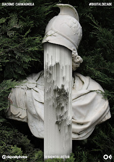 Based more around photography work than graphic design, I loved the concept behind the work; "create the Glitch Art works that represents the fragility of our time." - I interpreted the piece in relation to my project, particularly the way the face is "caved" in using geometric lines, quite similar to the glitch style of research I also looked at. Although the intention behind the piece is completely different to what I interpreted at, I love the style as it's hyper-realistic by using photography and it looks like the face is almost carved out.
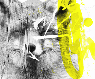 My response was trying to relate back to the brief, I didn't want to stray too far into photography or make it over realistic, but I liked the implied implication of a broken face and sort of the digital, geometric lines over taking parts of you. I chose my base image of a fox again and tried to mimic the work in my own style. The piece was more meant to be free-flowing and nothing too serious, I spent less than 10 minutes on it, but like the contrast between the digital and more 'painted', 'flowy' side of the fox.
This would also be my first way of mixing the two styles together from my previous research. I liked the effect overall and wanted to explore this further.
Ref:
https://www.behance.net/gallery/26317147/Glitch-app-artwork
https://www.behance.net/GoreCarmagnola
This led me to an artist called Giamoco Carmagnola, an italian graphic designer. Initially, the concept of the project was hard to establish - I found Carmagnola through researching self portraits in graphic design; and when approaching the source (a tumblr blog) he'd posted it on, there was no clear explanation behind the art work and what it represented.
 Based more around photography work than graphic design, I loved the concept behind the work; "create the Glitch Art works that represents the fragility of our time." - I interpreted the piece in relation to my project, particularly the way the face is "caved" in using geometric lines, quite similar to the glitch style of research I also looked at. Although the intention behind the piece is completely different to what I interpreted at, I love the style as it's hyper-realistic by using photography and it looks like the face is almost carved out.
 My response was trying to relate back to the brief, I didn't want to stray too far into photography or make it over realistic, but I liked the implied implication of a broken face and sort of the digital, geometric lines over taking parts of you. I chose my base image of a fox again and tried to mimic the work in my own style. The piece was more meant to be free-flowing and nothing too serious, I spent less than 10 minutes on it, but like the contrast between the digital and more 'painted', 'flowy' side of the fox.
 This would also be my first way of mixing the two styles together from my previous research. I liked the effect overall and wanted to explore this further.
Ref:
https://www.behance.net/gallery/26317147/Glitch-app-artwork
https://www.behance.net/GoreCarmagnola
Friday, 7 October 2016
Presentation Development
Further to my research, I looked into the definition behind each word to clearly establish to the audience an easy way to explain my question.
For my question specifically targets the television aspect of the company - "the regionalised television service for local news and programmes throughout the day", this is to further down the research and make it easier for myself, as I don't have a long time to present the PDF. Although television has been broadcasted since as late as 1927, I'm going to focus specifically on the more "modern" era of the BBC (between 2007 and onwards)
The BBC has 9 television channels currently in circulation: from the more well known BBC ONE all the way to the Children's television channel CBEEBIES to BBC Parliament - which looks primarily at the government and House of Commons
I've further narrowed down the channels to the main three, as they're the ones with the most history, re-branding and primarily the Ident which is what I wanted to look at: BBC ONE, BBC TWO, and BBC THREE.
I started planning out what I wanted the PDF to look like as it would enable me to have more "flow" to my presentation and know what was best to explain. I also wanted to answer questions and talk in a more informal tone, as this was what I'd be comfortable with.
Ident:
"A short sequence shown on television between programmes to identify the channel"
BBC:
"The BBC, (British Broadcasting Corporation) is a British Service Broadcaster (which includes radio, television, and other electronic media outlets) - the BBC are the largest broadcaster in the world, founded in 1922. Their networth is over £5.6 billion."
Broadcaster:
"Distribution of audio and video content to be distributed by an audience"
For my question specifically targets the television aspect of the company - "the regionalised television service for local news and programmes throughout the day", this is to further down the research and make it easier for myself, as I don't have a long time to present the PDF. Although television has been broadcasted since as late as 1927, I'm going to focus specifically on the more "modern" era of the BBC (between 2007 and onwards)
The BBC has 9 television channels currently in circulation: from the more well known BBC ONE all the way to the Children's television channel CBEEBIES to BBC Parliament - which looks primarily at the government and House of Commons
I've further narrowed down the channels to the main three, as they're the ones with the most history, re-branding and primarily the Ident which is what I wanted to look at: BBC ONE, BBC TWO, and BBC THREE.
I started planning out what I wanted the PDF to look like as it would enable me to have more "flow" to my presentation and know what was best to explain. I also wanted to answer questions and talk in a more informal tone, as this was what I'd be comfortable with.
Thursday, 6 October 2016
Feedback
My first feedback for my project was from Jay. At this stage, the only work I had was initial sketches on what I wanted my final piece to look like and a starter to test out the graphic styles I wanted. Jay led me on the right track to inspire me for further research methods and to continue working at the pace I was set on.
The first idea I was given was using the fox as a way of portraying myself. Because the project I'd chosen to undertake involved me personally and looking at who I am as a person instead of just the general concept, a fox was obviously very meaningful to me. I love the animal and related somewhat to it. I'd drawn out a style I wanted to play with just using a googled image of a fox as a base; Jay was really great at telling me that maybe this is a way of intertwining animals and moods with the project - to look at both and see how they could fit in. Based on spirit animals and totems, an animal can be attached to a certain persona or mood and thus be fit in with a person.
It was really great to get someone else's ideas into my project as I'd never considered keeping the animal before, it was initially just a base to work upon in development. This made me want to keep the fox and try and intertwine him somehow into the final piece. I'd also settled upon a huge A3 illustration to work towards, something I'd never done before. I really wanted to research and develop a lot instead of being set on one idea.
Cybernetic: Experimentation
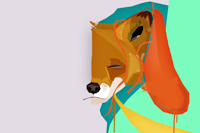 I initially started developing styles based upon my chosen artist research. The first two prints, done with a tablet and photoshop, were directly inspired by my David Walker research. I love the slight realism to the piece yet the way my brush strokes sort of imply life, a quick pace about the work. One of the things I wanted to do for development was to limit myself to around 2 hours a piece, even less if I could. This was to not get too carried up away about 'finalising' something, I just wanted to see how many different styles I could incorporate in a short amount of time and to see if they worked well together or not. This was a lot harder than I realised, as they're such contrasting styles; one works for the flow, quick marks and one is more precise and boxy. This sort of set me off track about the idea I had for my main piece as it was becoming harder to piece together two styles, however, I felt they did mark the contrast between Offline and Online.
Overall although I have a few mishaps and boundaries to cross over to gain momentum on my final piece, I was really enjoying the experimental stage that I'd started doing and wanted to combine the two styles to find something that would look great on my final piece, which was my next task.
Ref:
https://s3.amazonaws.com/gs-geo-images/0b119fd3-2b7a-4040-81cb-ef58b24b84d5.jpg
http://sandara.deviantart.com/art/My-brushes-351007003
http://zhuzhu.deviantart.com/art/Z-PS-Brushes-V6-154905327
Wednesday, 5 October 2016
Cybernetic: Mood Research
Another thing to consider for my project is the association with moods and certain personalities. Particularly if I wanted to do a piece based off emotion it would be a good idea to research into the words and emotion associated with each colour.
I'd always considered colour when working in any document, whether the scheme worked well together or not, but never in depth about the certain emotions that each gave off. Because this was an emotive piece and I needed the message to come across without any text, I had to research into colour clearly and make sure that each side gave off the right response.
Ref:
http://visioncarebenefits.com/24568/psychology-colors/psychology-colors-brilliant-with-color-theory-in-advertising-philosophy-communication
Red Intensity, Anger
Yellow Jealousy, Aggrivation, Joy
Orange Warmth, Excitement
Blue Sadness, Calmness
Green Nature, Jealousy
Pink Calm, Loving
Purple Powerful, Calming
White Neutral, Cold
Black, Mourning, Dark, MysteriousAlthough it was quite apparent what most words are associated with, it was interesting to find that blue was something of calmness. For my project, I wanted blue and grey to be associated with depression and sadness, so this was something to consider - how can I make blue be associated with this without specifically writing it down. I wanted two contrasting colour schemes; blue/grey and to oppose that, yellow/red/pink. These are contrasting "emotions" as such.
I'd always considered colour when working in any document, whether the scheme worked well together or not, but never in depth about the certain emotions that each gave off. Because this was an emotive piece and I needed the message to come across without any text, I had to research into colour clearly and make sure that each side gave off the right response.
Ref:
http://visioncarebenefits.com/24568/psychology-colors/psychology-colors-brilliant-with-color-theory-in-advertising-philosophy-communication
Cybernetic: Animal Research
 Further into my design process, I initially sketched out an animal as just a test shot (later I would have incorporated a face instead of the animal).
From feedback with Jay, I thought this could be a good idea to intertwine into my project; namely, associating animals with our emotional state. Although going slightly off the basis of our self vs something else, I thought that this could be interpreted into an idea of your online vs offline self and clashing personalities that we often get with our online persona.
This took me to research into animal/spiritual meanings and what they are associated with, personality and trait wise:
Wolf - Intelligence, Social
Owl - Wisdom
Bear - Strength
Hawk - Focus
Fox - Cunning
Butterfly - Light of being, playfulness
Cat - Patience
Horse - Driving Force
Panda - Gentle Strength
Rabbit - Loneliness/Shyness
Deer - Compassion
So for example, if I were to select animals I feel would depict myself, or specifically my online vs offline self then I'd choose a Panda or a Horse, then a Rabbit to compare. I believe it's quite telling of your personality and proved for interesting research for each culture to look into. It'd also be nice to have some self portraits clashing with the animals that you choose to believe you're associated with, with what your depicted as. There's lots of viable options for mood, colour, personality etc by going down the animal route however I'm not sure how I can bring this back into my project to the Online world.
Ref:
http://www.spiritanimal.info/
https://whatismyspiritanimal.com/spirit-totem-power-animal-meanings/
After Effects: Shape Motion
Our first After Effects workshop back with Sara looked at shape, focusing on motion within shape and playing around with the tools after effects could provide. First we were given a canvas in illustrator to create the shapes we wanted - it turned out a lot different in motion than it did flat; I barely touched a lot of the shapes I'd created, but I liked the way it came out like that, a lot more unpredictable and working on the spot.
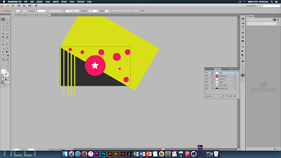 I really loved this workshop, it was a chance for me to refresh my memory into After Effects after not working on it all summer and to play around with what I'd learned from my final project, Chernobyl, with presets and styles. I'd chosen two colours that were default on illustrator, namely due to the contrast between them and the bright colours standing out between the dark background.
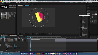 Although we were tasked to create an animated background, I chose to take this one step further as an animation student as well, I played around with transitioning, shape motion, typography and even introducing music at one point to tune it to the beat (using free audio from the Youtube Library) From this workshop I managed to learn a few things about pacing, illustrator (which I'd never touched before prior to this) and getting to grips with compositions. Previously I'd never been one to use compositions, but after starting a side project alongside this, it was something I was becoming more and more fond of. It made editing work a lot easier.
Inspired by this workshop, and Steffen K's 30 second reel that we looked at - I'd also go on to research more into the artist's work outside of the reel, which I found equally as fascinating and captivating I wanted to do something to take my After Effects skills to the max level. I chose, based off the 30 second reel, to do something similar, sort of experimenting and learning how to do motion that I'd always wanted to create and learn about for a side project to add to my portfolio. Working with what I know and want to learn, I'd stick to a similar colour seen in this workshop.
https://vimeo.com/steffenk
Monday, 3 October 2016
Lecture: Market Research
The lecture left off from the previous one, introducing us to more marketing methods the theory behind marketing.
 The theory behind marketing is that, although you initially start by creating your own ideas, the development and design start being modified based off the company and market you provide to. The design concept will usually start to be changed depending on who the product is for. Likewise, with development, the market is to consider how much money is being placed into the production of your idea - so that's another factor to consider.
Marketing:
Idea Generation
v
Concepts
v
Design Concepts
v
Development
v
Embodiment
v
Detail Design
v
Finished Article
 The theory behind marketing is that, although you initially start by creating your own ideas, the development and design start being modified based off the company and market you provide to. The design concept will usually start to be changed depending on who the product is for. Likewise, with development, the market is to consider how much money is being placed into the production of your idea - so that's another factor to consider.
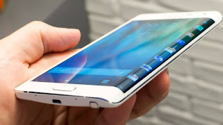
Another issue to be aware of and consider is the errors that come up when designing and to justify between design or own human error. For example, Samsung's recent issues with their phones - who would be responsible? The human who created the battery or the designer who designed the phone? Arguably it's hard to establish between the two. The idea behind this is to recognise any mistakes or errors with the design, especially if it's a design error; be aware of any language barriers, and to make sure to research/note your work thoroughly - so you're able to back up yourself if any such errors were to turn up.
Understand what is happening... the world, the economy, the client, the firm, the market. You should therefore need to keep abreast of the NEWS, the real news that means you're not out of touch with the real world, market and economy. Always ask questions before undertaking a design.
The next part of the lecture was about the client who is seeking to fufil their intentionsw ith you, the designer. Sometimes they don't give you all the information that you need - this is normally unintentional. The idea, although quite common, is to ask questions & assess the situation - find out what you need from the client.
SWOT Analysis
Strengths }
Weaknesses } Internal (of the firm)
Opportunities }
Threats } External (of the firm)
I found this lecture to be a good way of remembering how to approach clientele, businesses and any future employment opportunities you have - always remember to ask questions before undertaking a design and to be thoughtful about what you put into your own work, as it made be interpreted in different lights depending on the audience.
- right talents
- right team structure
- involve all parties
- ensure management of information
- encourage collaboration
- resolve problems quickly
- ensure effective communication
Sunday, 2 October 2016
Cybernetic: Design Research 3
Continuing my research into portraiture in graphics, I came across an artist called David Walker. The blue piece in particular is what drew me to his work, the colour palette I immediately felt inspired by and wanted to re-create in my own work. As I'm coming down the route of using emotion and personality in my project, I felt that Walker's work was something to draw immediate inspiration from; the use of colour, texture, brush strokes, with a mix of realism is my intention for my project and to depict the two contrasts between the online and offline world.
Although done by hand, my aim is to recreate a similar appearance using brushes on Photoshop with paint strokes and mimicking the contrast between the background and the bright colours from the face. The work has been an inspiration for me because although it isn't exactly what I intended my work to look like, it's something I'm going to draw inspiration from and recreate in my own way, in Photoshop or Illustrator. Walkers work brings an emotional response to me because of the agressive strikes of colour and paint he's used.
Ref:
http://www.artofdavidwalker.com/
Subscribe to:
Comments (Atom)


