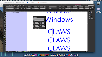
Our first process and production session back with Aidan was to explore and introduce back into typography. I'd never given much thought about kerning, tracking, etc; all the things we'd learned into the lesson and it was nice to give more detail that I'd usually do to type. The session had already been touched upon in last years workshop week, so I found the session especially relaxed - it was nice to play around and experiment with different words and not have one final outcome.
 The first task was to explore kerning and tracking, specifically, the gaps between each letter and how this would effect the overall 'flow' of typeface. I found it quite interesting to see how based on how each letter is to one another would effect how the overall font appeared, especially when closing the gap between the L and A in 'claws'. This was something I'd never considered before and can be taken away from the session when exploring type.
Our next task allowed us to explore text even more in a personalised manner, given any letter and to see how illegible, or not we could make a typeface. I chose a C to begin with but opted out after realising it couldn't be manipulated as much as other letters. The way the font face, and using shapes to cut through the type making it barely recognisable was quite clever - for branding especially it would be a good way to stylise something from modern or not.
The typography session, although I'd done before, I did really like because it was more refreshing to have a relaxed session compared to being overwhelmed with information. By giving us a lot of time to experiment with type, I could refine my ideas and expand upon what I'd learned in todays session (especially with kerning and type to make the word seem more put together)
Overall, I really really liked this session. It was a nice change to do something so relaxing and to consider type in a different perspective from colour or font-face. I'd love to do something like this again so I can consider adding a typography project into my work.


