Monday, 25 April 2016

Lecture: Design

For my final Monday morning lecture presented by Stephen, we looked at the concept of design and thinking, the thought process behind design and how this can benefit us in our current and final project. Firstly, we looked at the Design Council, who developed a diagram that is a simple graphical way of describing the design process. From looking at the diamond in the lecture, I could see how this would feedback into my own work, it seemed very relatable to me.

This is something we looked at in the first few weeks, the first section of the diamond starting the project and then leading to the definition stage, the developed and then the delivery stage, when the product is finished. This process is what I've always followed, at each stage I can go back and relate my project to it. The lecture was useful in terms of thinking back to what I've done in my project so far, and allow me to tick off if I've done the right design process.

We then looked over the 7 stages of the design process:

  • Refine
  • Research
  • Ideate
  • Prototype
  • Select
  • Implement
  • Learn
"Your job isn’t to make everyone happy. It’s to make your target audience happy."

The lecture reminded me that, with my current project, I need to focus on the target audience: when I've based my work around a certain audience it becomes a lot easier to produce content, as you can narrow down your intentions, design and the writing to suit the best audience - with my current project I hadn't considered this before, so this lecture was a good refresh to go back and consider my intentions for this project - I also felt a lot more confident and content because we'd have to look over the development for our project, plan out the design properly and make sure there is some intention behind each slide. This is what I'd done with my project.


Saturday, 23 April 2016

Intro Cinema 4D

In one of our last introduction sessions with Stephen, we were given an intro to Cinema 4D, a software used for 3D animation which is meant to be intertwined with After Effects.

At first were were shown examples of how the software can be utilised, from professional people to more simplistic designs that we ourselves were capable of recreating. I really did struggle with getting to grips with Cinema 4D, as the interface is completely different to that of any other software that I've seen. However, I found the work shown to be really interesting and enlightening to the capabilities of how clever Cinema 4D can be - it also made me realise how, when intertwined with After Effects, the work produced could be at a professional level, something that I'm looking to re-create myself.

We looked at the tools of the programme - this, again, proved quite difficult for me as I struggled to get to grips with remembering what each tool was for, although generating shapes by using the top tool, and scrolling along the design board were things that I could pick up, and proved quite easy to get to grips with, some things that were more about editing the shape and even creating the animation itself just confused me at the over-complexity of the software, which I didn't like at first.

I struggled to get to grips with Cinema 4D in it's entirety, I think after a lot of practice and playing around with the software, which is what I normally do to get to learn a software, will prove better and mean that I can experiment and play with the software at my own designated pace and can discover things we were not taught in the session. Overall though I was really impressed with the work shown in the session and some of the things we could produce very quickly, although I still believe the tools are hard to get to grips with.

Monday, 18 April 2016

Lecture: Gentle Ease

One of Sara's final lectures, titled "Gentle Ease" was concentrating on the use of After Effects - an Adobe Programme I've been using throughout the year, particularly on my final project, looking at the graph editor and the use of drawing and animation put together. This lecture was of high interest to me because of the topic, and this could be research for my work. A lot of the lecture included visual material, my favourite were the more graphic-based motion pieces, that focused on After Effects to create them, and less of the drawing ones at the start of the lecture.

One piece, "Just One Day" was something of amazing interest to me. Although created via by hand - Stop Motion, it was placed into After Effects and scaled up. Mixing both mediums of the by hand elements and software was something I found interesting - because the objects were all scaled up simultaneously, they don't line up correctly, which he could have done a lot more quicker and efficiently in After Effects, however, the method behind his work took a lot longer to make - it was his own choice, and made the piece move a lot more. The work is really simple too, I love the style that Kelly has created, it's simplistic and shows off the work well.

In contrast to this work, title sequences for TV's - even my own project, is usually done within a few week time frame, and although this is quick and sports a far more professional appearance about it, particularly with the use of the graphics and software they use (it's designed to look sleek, and as professional as intended, without any errors in it) it lacks any exploration. Usually the research for the project is so minimal in the time frame given that they cannot explore their research as thoroughly as they'd like, and thus, maybe not produce the most creative or thoughtful results.
     This made me think of our work currently and I'm glad that I separated out a few weeks just for the research, as it made me understand the piece a lot more and create a huge understanding of the work and the topic of choice. I'm glad I followed this route, with Sara's explanation it made a lot more sense to me and made me feel more positive in my choice to neglect creating the sequence at first.

recipesforbakingbread.blogspot.co.uk
Sara's blog and collection of documentation of her work was insightful; currently her focus is to document unbranded products and collecting objects that sort of fit into that. Some Soviet Salt packing, that she only bought a few days before hand, looked unbranded, with green screen printing technique used. It looks extremely aged because of the printing technique used, and without any recognizable branding, in just an old paper form, it ages the work well; although this process must be extremely inefficient at the cost of it - as it looks printed out with screen printing, this wouldn't be a practical way of making products due to the cost.
Sara told us that she was trying to do the same in her work - bring language into the work she is making, by using different methods to create unbranded packaging and something that looks aged, although it is brand new, and throughout her blog documents things that remind her of this process and allow her to research the work very efficiently.

The final video of the seminar was by Drew Tyndell, who's clientelle range from the Carton Network to General Elektriks - he has artist creativity and the main focus for his work is drawing, particularly intertwining the two together to create a colourful moving piece, one of my favourites from the seminar.


The process of the video is called 'romoscoping', a frame by frame concept where you trace from an original image, usually hand-drawn, which gives a beautiful effect that is slightly off-frame for each second, giving a lot more movement to the piece; however it is extremely labour intensive, given how long (3 minutes) the video is, it must have taken Tyndell a long time, a true labour of love. The piece is very light and fresh, and although it hasn't been made very quickly, the energy in the work and the colour shines past the technical process and allows something that looks very vibrant and modern.

Overall this lecture was really interesting tome, intertwining both drawing methods and animation is something that I admire greatly as the work takes a long time to produce ,although the work is defiantly worth it.

Thursday, 7 April 2016

Final Project: Samples

For the final project, I began developing animated samples based off the still design boards I'd created that were reflecting the theme of what I wanted my intro to look like. Taking inspiration from Narcos, True Detective, I wanted to focus on double exposures and intertwining several images on top of each other. My main reasoning behind this was that I feel it conveys more of a story than just a plain image, so I took about researching the best way to do this; I also used free stock videos of smoke, ink and other objects that could be easily overlay-ed using the screen blending mode option. I wanted to use ink and smoke to reference back to the accident, and also to represent that this accident literally took over these peoples lives, as this was only meant to be a few days of repercussion - however they never managed to get back to their own city. 

My first sample was taken directly from this design board:


I wanted the map to be the focal point of the double exposure originally, but after finally coming up with what I wanted the purpose of the documentary to be about, I opted to use images from Chernobyl of people, whether they be from new or at the time of the accident. I wanted this to become more of a "emotional" documentary about the lives of these people, and how they were over-run by this incident, as there's plenty of documentary on how the accident came about. I love the way the ink runs over the face of the child in the original sample, however, I also wanted to reflect the "radioactive" side of the incident, so opted for a different colour palette in the second sample.


For one of my first final samples, I changed the ink dripping to smoke, to see what the effect would look like differently and played around more with the colour tone. I chose to go with red, sort of inflicting a "warning" sign and red reflects the danger of the situation these people were in. Out of all samples, this is definitely my favourite one, I added a lot of grain to the footage to make it look as old as possible, and inverted the colours of the girl to give it more of a horror/fear look. Although this is my favourite one, I would definitely slow down the smoke next time as I feel it's too quick for an introduction, and would work on the "Directed by" text to animate it a bit more, which is something I was planning to do for the introduction anyway. 

Overall, though, I definitely want to integrate Sample 3 into my work as this is clearly my strongest sample, and works best in my opinion at conveying what I want the accident to - I may play around with different colours and textures, and even go and take textures of my own to give it more of my own look about the work. I'm overall very happy with what I've come up with so far and it's inspired me to create many more samples to put together for my introduction.

Wednesday, 6 April 2016

Seminar: Essay Feedback

One of the latter seminars with James was looking back at the feedback we'd received from the submission of the first draft of our essay, I'd received a 54/100, which although I'd aimed for much higher, I was quite happy with because after looking over the feedback given by a teacher it made a lot more sense why my grade wasn't as high as I'd intended it to be; I'd started the essay with a completely different intention to sort of what it came out as, so ended up re-writing the introduction to make it suit the essay more.

Thanks to the feedback, I was able to make a lot more sense of the essay - as I've previously said, I struggle to make sense and form sentences properly, this is something that when vocally speaking I also don't do very well, so to have two submissions was extremely helpful to me. I was able to take the grammatical errors in the first submission and flip them, and confidentially get together the correct topic throughout the entire essay. It was nice to have another pair of eyes looking at my work as I'd clearly missed quite a big chunk of errors that were around the piece; I'd made many grammatical errors and wording corrections that needed changing because it didn't make a lot of sense.

James sessions allowed me to view my feedback and discuss it with my peers, particularly it was useful for when we were all struggling to meet the same deadlines - my peers reassured me that I'd done enough and was on track, which allowed me to worry less and concentrate on my other ongoing projects at the time. I found that although I didn't bring my essays in to view for feedback, I could still gain a lot of feedback via the first submission so it made me feel a lot better, instead of doing just one finalised submission, I was able to go back and make the changes that were needed to potentially push the grade of my essay up from a 54.

Monday, 4 April 2016

Film: Helvetica

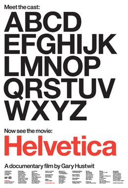
Today's lecture would be around the film 'Helvetica',  a documentary by Gary Hustwist (who also created the documentary Urbanized) The film was released in 2007, which was to co-inside with the original release of the typeface.

The 80 minute documentary main focus is the history of the typeface and how it was created, the practicality of the font and the unique differences between creating a typeface now and in the time (1957) the font was formed; having interviews with famous graphic designers and type designers who all give their views on the font, as well as the fact the profession is not very well known - one artist cited that someone didn't know what the profession was when told about it.

Arguably a long film, the documentary in my opinion lacked any interest to me as it was too in-depth for me. Although I love the typeface itself and have used it quite a few times in my work, I disliked the way it was presented and the in-depth knowledge about it, as it sort of became quite tedious over the time of the film. The font itself I love as it can adapt to quite modern times - although made in 1957, it's still famously used today and looks very in-style still, the font is so modern and its flexibility made it one of the most popular fonts of it's time.

The documentary also focuses on the differences between modernist and postmodernists, the post not appreciating the font face and gave it a lot of negative reception. This proved quite an interesting section, as to me, it's just a font, and works very well, so it was interesting to see from a different view of why someone may not like it.

Overall, although the documentary was long, I liked the meaning behind it - with graphic design, a lot of people forget that there is people behind the work and that a lot of it has a personal response to it. The font was created for a reason, and when just seeing it on screen, you forget someone spent months, even years creating the product.

Wednesday, 23 March 2016

Final Project: Research 2

My next title that I wanted to research more in-depth was True Detective. I'd always been inspired by this even from my college work, where I'd done a huge project on Double Exposure. The technique was something I'd always loved, as it allowed you to convey messages from a still image and reflect the story of a person or object by overlapping it with another - it also created a beautiful image if done correctly.

True Detective was also inspired by Christoffer Relanders work, which I'd researched for my Photography project, so I was quite familiar with how he'd done his own style - this was all on one image on a singular piece of film, no photoshopping was done for the images to come out.

When pitching their concepts, True Detective used the work as a visual reference, marking this as their main inspiration.
"Visually, we were inspired by photographic double exposures. Fragmented portraits, created by using human figures as windows into partial landscapes, served as a great way to show characters that are marginalised or internally divided. "

True Detectives pace of the introduction is also something that inspires me, it matches the beat in a perfect manner and allows the audience to view each of the frames clearly.

I also integrated the research for True Detective into my own research. They focused heavily on researching the styles they wanted for their introduction, which is what I intend to mimic for my own project, as this is a good way of visualizing what you want out of your title sequence; 


Monday, 21 March 2016

Final Project: Research

After narrowing down my chosen theme to Chernobyl, I opted to begin research into my favourite introductions that would prove as inspiration for me. The main favourites that immediately came to my head consisted of Narcos, True Detective, True Blood, The 100, Making a Murderer and Outlander; quite a few of the list came from the same company titled "Elastic", the vibe they all generate is establishing the story and characters in the introduction in a clever way.

I wanted to approach this brief as professionally as possible, so after discovering a website called Art of Title, which gives interviews and shows design concepts for title cards in film and television, I researched into my initial favourite introductions and read about how they came about to create them.


For Narcos, the designers wanted to delve into their research as much as possible, shown above, is the design boards and visual references that they came up with to get the exact appearance they wanted. In my project, I took about doing visual references very similar to this, as it was a way of showing individual features that I wanted to go into my introduction. I used Pinterest, Google search and deviantart to research into textures, imagery and colours that would reflect Chernobyl well.


Narcos kept to the theme of the show very well, researching into old pictures of the title character they were concentrating on, using film textures and planes as the focus of their research. I love their use of colours as this also reflects well on the intention of the programme, and the abandoned concepts (2nd image) was my inspiration for my own project. Although it doesn't convey the message that they wanted to for the title sequence, it reminds me of my own work and what I wanted to create, so became one of my main points of research, especially the use of texture and colour, the smoke being something that I would later on use in my own work.

"One thing that I wanted to really focus on was getting away from the traditional tropes of narco culture. Talking with the guys and really understanding Colombian culture and some of the more bizarre aspects of Pablo Escobar’s rise really gave us an awesome footing for ideation."

Thursday, 17 March 2016

After Effects: Final Project


For our final project of the year from Sara, we were set a collaborative task to put together 22 videos all made by each person in our class, which, when played together, would show sea creatures swimming in and out of the frames and would make one consecutive piece. Since being absent from the character After Effects project, I initially struggled with coming to grips with making my animal have individual layers on a PSD document. I chose an Axolotl - thinking this would be easier to do as it just swims along. I use block colours and went over a base image in Photoshop, separating out each layer.

I learned throughout the entire process to make the image as simple as possible, as I found it really difficult to subtly move the legs without showing where I'd cut around the older image, so it didn't look quite as realistic as I intended - I chose to make the animal blink, and instead worked on things that would make the piece more realistic instead of re-doing the animal; this involved me generating bubbles on After Effects and using a layer to create the light shining into the sea. This made the whole piece a lot more realistic.

When creating the moving Axolotl, I chose to create something very fluid and give the animal some life by making it move, the animal needed to be "scared" by something because of the jerky movement half way through. I then created more bubbles to generate, and added fish quickly made in Photoshop and used key frames to move it along.

Overall, this utilized all the skills I've learned in After Effects so far, it didn't take as long as initially expected, so was able to add a lot more effects and spend more time focusing on the smaller details. I'm quite pleased with how it turned out, however I probably would have used more detail on the animal itself and fixed the issue with the legs not being able to move as far as I'd have liked, as he looks quite still/frozen. The overall presentation at the end was really interesting for me to see as it was nice to see everyone's styles come together.


Thursday, 10 March 2016

Physical Process: Typography 2

My next typography session was going off from the last session we had, focusing on creating my own typeface. As I discovered in the previous workshop, my typeface had to be as minimal as possible to prevent it from being over complex and unable to be read.

Whilst I coloured my original alphabet idea - the monuments, I concluded these would be too difficult to make a full alphabet out of, although the idea behind them I liked, they were quite difficult to make out the actual letter shape and took a considerable amount of time to draw out. They would be perfect for a presentation or something to "promote" the monuments, but concluding the amount of time I'd have to focus on the alphabet, I decided this option wouldn't be best in a practical way.

I instead came up with a few other ideas - to do something based on my interests, or something that I'd liked - a cat. I'd be able to create the animals leaning over, arching their backs or using more than one to create the shapes that I desired, and if I kept this as minimal as possible then it would be much easier to draw and create.  I also liked my original idea of creating a font that would cohere to the block layout of grid paper, each one fitting into one tiny block. These looked quite futuristic, using straight lines to join the letters together.

Overall I'm happy with how the letters came out, whilst they're simplistic, they're also quirky and something I enjoyed drawing, especially the cats as it was quite challenging to draw them in different styles whilst retaining a bit of character to them.


Monday, 7 March 2016

Final Project: Self-Negotiated

For my final project of this year, our task would be to base a animation or graphics piece around the themes found previously in our essay. Whilst I am a graphic student myself, after nearly completing the year I really wanted to try out Animation again and see how far I could push my skills in After Effects, thus, I selected to create an intro for a fake documentary of my choice.

My first exploration in coming up with a theme for my intro was to pick my essay subject - Apple. After some consideration and research, after seeing how many Apple documentary's and biopics there are in regards to Steve Jobs, I didn't want to create something for an overly documented subject. This led me to start documenting my interests and writing down things that I would find appealing - I feel this would make my project easier to get into as I'd be creating something about thing I'm genuinely interested about.

My interests are mostly to do with the weird and conspiracy theories. I wanted to do something that, whilst interesting to me, wasn't something that would be considered upsetting to some people - at one point I considered the Holocaust, but thought this would be too sensitive of a subject. After talking along with my peers and flatmates, I came up with these three things based around my interests:

  • Ancient Egypt
  • Chernobyl Incident
  • Jack the Ripper

These all have the same theme to them; they consist of conspiracy theories behind actual real life events, which motivates my interest behind them. I wanted to do things that were talked about before and the subject of interest, but not anything that had recently been done. As well as this, subjects who'd documentaries I'd previously seen and had poor introductions were also the target of what I wanted to do, it would be really interesting for me to recreate and compare them to the titles.

I've started a sketchbook where I'm heavily researching into each incident, watching documentaries and finding styles on Pinterest, Behance and other websites to get a feel of what documentary I want to give off to the audience. I particularly like "Making a Murderer" and "True Detective" which both have neutral colour palettes and quite a rustic, paper feel to them. This would work well for Jack the Ripper as of the time set.

Overall, I've not done a massive amount in the two weeks that we have been set, just garnering ideas together and creating a sketchbook - I really want to spend time researching and looking at different possible outcomes before going ahead with any starting point.

Monday, 22 February 2016

Lecture: Prequel Sequel

The main intention of the lecture was to focus on the idea that nothing is in fact original, everything comes from inspiration and that you'd be very lucky to find something that has not already been done, in some shape or form, before. Furthermore, when we begin our creative process to communicate, we have to rely on what we already understand and know, and have seen before, to create this communication otherwise we wouldn't be able to make this write and connect it to our intention.

         "Those who do not want to imitate anything, produce nothing." 
                                                                                                   - Salvador Dali
A lot of the lecture looked at the different intents of work that was created online - internet memes, for example, are funny to look at, but lacks value and actual intent because of the superficialness of the work. We also looked at the fine line between association with an previous work, and plagiarism - is intent not the breaking point for this?

The film 'Everything is a Remix' was the exact reasoning behind this. In the first part of this film, 'The Song Remains the Same', was showing different songs throughout the years that sound similar and the lawsuits (or not) they had to face for a few notes of song that could have made the exact likeness out of another. Although some people argue plagiarism, does it not just mean they've had the same creative output and come up with something similar out of pure chance? A lot of older, rock songs seem to all sound the same and have such come up in the first section of the film.

"Legal remixing is fine, illegal copying is not - if your work fails to distinguish itself enough then you must attribute!"

Looking at our audience type, we learned that having a pre-defined idea about the intent of the audience and what our audience is about allows us to create sort of a narrative about our work, and making an assumption, although sometimes a negative thing, allows a much more deeper understanding and the work to have a lot more meaning behind it.
The Marvel Cinematic Timeline, for example, have worked on this over numerous years which links most of their films together and in a continuous way. It has been presented commercially, with many characters starring in different films and having a set timeline of events which worked well as this is what the audience wanted to see - something that all connects together.

"Don't try to be original. Just try to be good. That sounds sort of naive, but it's true." 
                                                 - Paul Rand

The point behind the lecture was that, although tools and practice of the trade are extremely useful, an idea is the most important thing and can set you forward the most. This is what I wanted to create in my final project, research was the key, and something that was responsive to the audience was overall what I intended to do - as my skills in the software weren't the best.

Wednesday, 17 February 2016

Seminar: Research w/James

One of our final sessions with James included researching into our essays further. As we were half way, or near the end of our essays, the seminar proved quite essential to see where my peers were in terms of their work, and to receive any motivation, feedback or responses I'd needed from James and my peers.

The discussion for the work was quite a small one, I'd have preferred some more feedback but didn't bring my own essay to be assessed, this could have proved quite helpful as from my first hand-in there were a lot of errors in my work. I could have done with James going through the work with me, my main flaw in my work is that I don't make a lot of sense; I'm unable to create sentences that sound correct and flow naturally, as this is something I also struggle with whilst speaking out loud. However, hearing how other people had progressed with their essays really calmed me down, a lot of my peers were behind me in terms of where they were at, which relaxed me and proved to help me to finish my essay at the correct time.

Although the seminar was short it gave me enough confidence to continue with my essay - if I had brought a sample of my essay for evaluation, this would have proved much more better for myself, as I'd have made changes to errors and my feedback for my first submission would have been a lot more positive.

Friday, 12 February 2016

After Effects: Camera Positioning

My next workshop with After Effects took our skills to more of an advanced level; namely, we worked on generating the effects we created in previous lessons and stylizing them differently and making them look more complicated. In this lesson was the focus of using the camera tool to have the text/or other objects zoom in or out, move to the left or right, giving more of a 3D definition to the work than before.

We learnt how to use the camera tool on individual layers - by making them 3D objects by clicking on the small box near the 'fx' option, it would allow only the layers that were selected to be effected by the camera. You can also edit the amount of cameras you can have and create them on separate compositions if you want to overlay them all.


Inspired by Troye Sivan's "Wild" lyric video which involves yellow petals falling down on a cascade of lyrics, I took his other song from his new album, "Talk Me Down" as the pace was a lot slower than wild and I could work on using the camera tool at a slower pace. The intro and petals were created using the generate tool, and then I used an separate camera to make it sweep in at the end. Instead of changing the colour on the same layer I just duplicated the petals falling and changed the colour so they could alternate colours in a more slower transaction than sharp colours, which is what I envisioned more when listening to the song.
The colour changes are inspired by the video too, and work well together.
I also wanted to alterate the camera position on the text, so created that as a 3D layer and pulled the 'Z' axis on the camera forward so the text would jump out. When using the camera positioning tool you have to reset it otherwise it'll remain as zoomed in as you want, which I didn't want for the next layer.
Over all this was a really simple process but worked so effectively at creating what I wanted, although it took a while to get the hang of I now use the tool a lot and value it as it brings something else to a video which would otherwise be quite 2D.


Sunday, 7 February 2016

Physical Process: Typography 1

Our next physical process workshop focused on typography. The task was based around creating a character-inspired font using the letters ANESG, then, eventually, creating a full alphabet. At first I was completely stumped for ideas - I've never tried to create my own font before, and found it extremely hard to think on the spot, but whilst looking through videos of different fonts and designers, thought that making a more complicated one for the 5 letters would suffice.

I chose to base these around monuments - A around the Eiffel Tower, using the internet to research buildings that reflected each shape (S and E proved difficult to find any for) and lightly sketching out in pencil first. I wanted the outline only, as this would be more simple to use and to integrate colour into if made into a actual font. When I was happy with the design I used a black ballpoint pen over the top to enhance the details and create something that was more finalised.

This took a long time to come up with as a lot of the session I was researching and developing the correct monument for the correct letter - I don't think this would be part of my final design of A-Z as this would take too long to do and not enough monuments create an actual shape, letters like B, S, H, F and Z would not be easy to find monuments for as they don't make practical building shapes.


My second character design I want to focus on was quick sketches using my own hand writing, using it in a italic way, outlined, or in a cartoon style. These were meant to be quick experimentations to come up with a solid idea.

For my last idea, I came up with the idea of using cats as the character's for my font. For each letter, they would be styled in a different position, either asleep, with another cat, or just stood up straight. Again I wanted to keep this as minimalist as possible, to make it far practical to use. This was one idea that would take too long but worked particularly well, especially for the N as the cat was stretching. Overall, I would probably take the most simple design and develop this for my typography project.