Wednesday, 15 February 2017

After Effects: Stats & Infographics


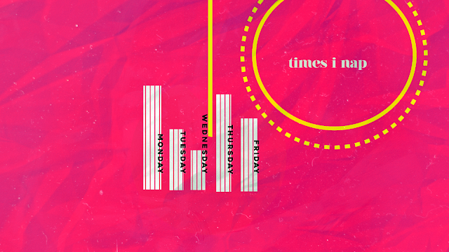
This process and production session was a lot more relaxed than previous ones, owing to the fact that I'd learned so much about After Effects in my spare time, and could easily mess around with the tools on my own. I'd prepped a lot of work before hand and played around with shapes/strokes and effects, similar to my Shape Workshop, and incorporated bits we've been told to do in the lesson.

My aim was to make something that was very me-like, and although I'm not girly in the slightest, my website at the moment currently is yellow themed, so I stuck to my signature "colour" as such and incorporated pinks in to make the yellow pop. Owing to Sara's teaching I also added in things I'd learned from previous workshops, like CC Page Turn or using stroke's in different ways.
I'd still say I was a novice at After Effects, I had to sit patiently and work around how I wanted something to be achieved slowly and it did take me a while to perfect anything, however I felt so much more comfortable in the programme then I'd ever previously had before.

Ideas came from the fact that a lot of the information may not be aesthetically pleasing, so my idea was to make it stand out and pop with the use of colour, motion and texture, adding them to give depth to the piece, and sort of more of a rustic feel. One thing Sara suggested would be to consider pacing in my work, as a lot of it is extremely fast paced and doesn't allow the audience to absorb the information quite as well as I'd have liked, and I agree. 
The process for creating my work is simple, which is to mess around until I'm happy with the outcome. I still have a lot to learn with the software but found it increasingly easier to navigate around, I knew how most things worked but was still coming to grips with how to make certains things to what.

I was really pleased with the outcome and would love to continue creating it, maybe as an introduction to my about page for my webite (I'd also have to change the location of Manchester, too!)


Wednesday, 8 February 2017

Physical Process: Type Stencils


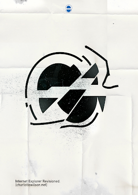
The second session back proved quite daunting to begin with - huge boards filled with different typography; especially since I hadn't done this in a couple of years. Despite my initial set backs (with Nick asking me to refine, and constantly add to my stencils) I was still happy with the work I produced, as it was quite reminiscent of my Art Foundation diploma. The way we had to work, with just paint and some pencils, took me back away from the technology side of design and allowed me to play with how far I could take just a simple medium. For my first piece, I kept it relatively straight forward and clean cut, using the 'e' as inspiration I made the stencil shape out of the inside of an E. Their were many interpretations of what the E could look like - the London underground sign, a burger, STOP signs, or even the internet explorer logo.


It was quite fun that my design unintentionally looked like something else, I couldn't see a lot of the things my peers were saying about my work, as I hadn't gone out of my way for it to look like anything at all. I was quite pleased with the repeating pattern - it would be nice to make some half tone work out of it, or make something like a postcard or cards out of them.

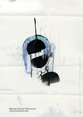
My second and third piece took longer to create because of the abstractness of them - the second piece I did was using the same template as before, and working with the paint to create more tones/textures. I used water to dilute the paint and create the splatter and drips, something that I thought worked quite well.

I really liked the flowy feel to the workshop - nothing was meant to be perfect, in some of my work there's lines where the lines aren't straight or pieces of paint have gone over their templates and made splatters across the work, but I like the tactile feel of the piece and how it reminds me of my time in Art Foundation.


Wednesday, 1 February 2017

Personal Work


Dalmatian created with Photoshop brushes


Sketch image for practice


Font/Illustrator Practice.


Hyperrealites: Moodboards


Inspired by "dreams & hyperrealities" and my 360 degree sequence idea.

Cinema 4D & Design


My first taste of Cinema 4D this year was a really successful one. Last year, I struggled immensely to get to grips with C4D, the pace of the workshops was too quick and I gave up quite quickly, which lagged me behind even further. This year, Jay told us to place our phones away and pay attention, which helped immensely with how I got to learn the ropes of C4D (even so much that my next project would use Cine 4D)


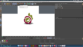
The hardest thing was keeping up with Jay; after using illustrator for a little bit in the previous project it made it much easier to sketch out the shape I wanted. After playing around with the software for a while, the interface was quite easy to understand, morphing together all the Adobe Software tools (key frames, colours, textures) - one of my favourite parts of the software was creating the colours and textures you'd wanted for each shape; for example, if you wanted a textured look, then you could insert an image of your choosing to create something that wrapped around the shape.


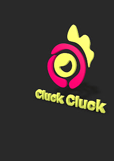
When I'd first started creating my design, my peers told me it looked similar to the shape of a chicken - hence why the text I'd chosen was "cluck cluck", I liked the shape, but afterwards thought it looked slightly tacky, though it was a nice start to Cine 4D that I initially wasn't confident in.

My favourite session so far was definitely this one, the relaxed atmosphere behind the work and the pace was a comfortable position for me to keep up with (I'd managed to learn quite a bit of transferable skills that I could retain and use for future projects)

The hardest thing I'd learned about the session was creating separate layers fro each of the shapes if I wanted to alternate the colour, as originally the entire file was pulled together, so I had to separate it and change the "extrude" to apply it to all of the separate layers.

Overall, I'd loved this session - I was quite surprised at how much so, and my previous distaste for C4D had gone away, as I'd thought it was quite complicated, but, actually, it was quite an easy to get to know software, and involved a lot of experimentation. I even applied it to further tests for my next project, Hyperrealities, shown below:


(The canvas was 360 degrees, rotating around the center object, in this case, a figure)