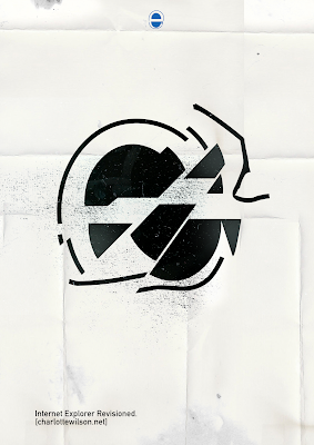
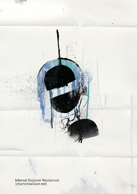
The second session back proved quite daunting to begin with - huge boards filled with different typography; especially since I hadn't done this in a couple of years. Despite my initial set backs (with Nick asking me to refine, and constantly add to my stencils) I was still happy with the work I produced, as it was quite reminiscent of my Art Foundation diploma. The way we had to work, with just paint and some pencils, took me back away from the technology side of design and allowed me to play with how far I could take just a simple medium. For my first piece, I kept it relatively straight forward and clean cut, using the 'e' as inspiration I made the stencil shape out of the inside of an E. Their were many interpretations of what the E could look like - the London underground sign, a burger, STOP signs, or even the internet explorer logo.
 It was quite fun that my design unintentionally looked like something else, I couldn't see a lot of the things my peers were saying about my work, as I hadn't gone out of my way for it to look like anything at all. I was quite pleased with the repeating pattern - it would be nice to make some half tone work out of it, or make something like a postcard or cards out of them.
My second and third piece took longer to create because of the abstractness of them - the second piece I did was using the same template as before, and working with the paint to create more tones/textures. I used water to dilute the paint and create the splatter and drips, something that I thought worked quite well.
 I really liked the flowy feel to the workshop - nothing was meant to be perfect, in some of my work there's lines where the lines aren't straight or pieces of paint have gone over their templates and made splatters across the work, but I like the tactile feel of the piece and how it reminds me of my time in Art Foundation.


