Thursday, 28 January 2016

Photoshop: Introduction

In comparison to Illustrator, Photoshop works around the basis of layers - whilst this lacks in the compability to zoom in and re-size, as this is not a vector software, Photoshop allows you to create
non-destructive editing and create thousands of layers on-top of one of another. The best use for this is to manipulate photographs. In today's session we're looking at the non-destructive compatibility; and to create a self portrait.

Although my most familiar software is Photoshop, it was still an interesting session to watch as I learned about art-boards which I don't use as often, and RAW images which are non-editable flattened images.

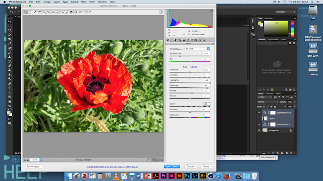
The majority of the session was touching on things I already new, such as layer styles which are used to apply over images. For example, darken is used to remove all white in the image leaving only the black, whilst screen does the reverse, creating different effects which I applied to my self portrait. We also learned about Camera RAW, a non destructive photo editing tool which provides information about the camera precisely and means you're able to brighten/modify the image without actually changing the original form.

Our project for the workshop was to create a self portrait. I touched back to my photography roots, overlaying photos from places that I've been to and lived by over a photo of myself. I used layer styles and non destructive editing by creating lots of different layers, so I could make very subtle modifications. The branches/trees were overlayed using the screen layer style, giving the edges of the picture of me that of the photo. I also used adjustment layers to modify the colour and textures of a blueprint to make the portrait more interesting and textured.

  • PNG = Portable Network Graphic
  • JPG  = Joint Photographic Experts Group
  • GIF  = Graphics Interchange Format


Throughout the session, Stephen showed us dual tone images. This was a type of layer mode found under "Image > Mode > Dual Tone" and required a black and white canvas originally. It was a tool used in printing and meant we could create two different colours, similar to a black and white style, over the image. The modes menu also allows options for different printing styles such as CMYK, RGB, Grayscale and more. This tool allows quick interchanging to them all.


Adjustment layers were also touched upon, although I'm extremely familiar with this. I used them in application to my own self portrait in a non-destructive way, by applying them over the top on a seperate layer and not to the image itself. They allow modifications to colour, brightness, vibrancy etc and are useful in creating images to a certain colour palette. 

In summary, although I've been using Photoshop for quite a long time, and this introduction proved really easy for me, it was still nice to strip back all the tools and focus on the simplest ones, as well as learn more about Camera Raw - which I'd touched on in photography. I'm quite happy with my portrait even though it's simple it works well using non destructive tools.

Essay Development


For our seminar session, we were re-placed into our groups from Monday and began to pull apart the questions that we are currently looking at for our essay. Our group chose to look at the brand/anti-brand question, although by the end of the seminar we opted to look at other questions, as they seemed much more easier to understand.
The idea behind the seminar session was for us to pull apart the question and the words, so for example, if "discuss" was part of the question this means it wanted you to take two sides of the story and discuss both and not just your own opinion. This made it a lot easier to work out the intention of the question and gave us a key point for research.


Lecture: Exploring G Minor


Sara's lecture involved using a piece of paper and creatively drawing my notes for the lecture. I really loved this method, it made more of an impact on me and because I'd been allowed to draw a few things, I was able to jot down a few things visually that I'd seen in the lecture. This was one of my favourite methods of doing this, it made me process each slide a lot more and retain the information.

Monday, 25 January 2016

Lecture: Graphic Responses to Sound

Our next sound lecture was concentrating on graphic responses to electronic sound.
"If you want to find the secrets of the universe, think in terms of Energy, Frequency and Vibration"
I learned throughout the lecture many different ways of interpretation sound through paper, frequency, animation, harmonics, and more digital responses such as Adobe, it allowed a wide range of material to be presented throughout the lecture and inspired me to really try something that was out of my comfort zone.

One artist, Leon Thermin, was a contemporary of Joseph Schillinger (a mathematician who explored music in the 1930's). The video shows Theremin playing his own instrument he created, a new form of electronic instrument using oscillation, titled 'the Thermin' - to me it's amazing how old the video clearly is and how different responses to sound can be based on your profession.


Although we looked over a lot more dated works; like Robert Hooke, Earnst Chland, my real interest lied in the more digital responses presented near the end of the lecture - they were something that would prove quite useful in terms of research and inspiration, and they are more interesting to me  as I much prefer modern styles of design and art:

Digital responses and music software have given us so many more opportunities and chances to create expression-ate pieces, as well as the ability to undo and recreate any mistakes, use tools such as Adobe software like Audition, After Effects, Photoshop which although modern, allow the capability of using the visual language that was much older. Adobe Audition presents sound as a waveform - much like oscilloscope, and this is something that we've all grown accustomed to seeing although the process is really old. It's interesting to see that a lot of the more older techniques around sound are coming forward still today, and act as main inspiration.

I was far more enticed into the digital work that was shown, such as Brian Eno, or using Cinema 4d to create a filmic piece, as these look to me like they have a lot of work put into them and visually look beautiful, it really inspired me to try animation out to see if I had any talent towards it, which I will be doing throughout my entire project. Although most of this lecture looked at previous forms of music responses, it was still interesting to me.

Thursday, 21 January 2016

After Effects: Kinetic Typography


Our next After Effects workshop was on the focus of typography. The brief was to bring in a font and information regarding the font; I selected Coolvetica, a spin on the font 'Helvetica', which is more rounded than the original. 

My focus was to try to be creative with my simple font, I chose to create an effect where the font looked as if it was being typed out simultaneously on the video - this was created by me manually changing the timing on each letter and moving the line along to create the effect of someone typing. Although it was a little tedious, I think the effect of the typing worked really well, it can also be improved by adding audio of someone typing along to it.


The next thing we were taught upon was to change the way the text transitioned in the beginning. Through using the CTRL button we were able to easily navigate around the time line, and using the position tool (by holding 'P') able to create time stamps of where the text would come from. By changing the position along the timeline, I could make the text sort of fly in different directions, which I did different ways for different effects. 

By having it come in different ways for the '1970' text, it created the appearance of "rolling in" - additionally, by using effects on the movement, such as blurring, it made the effect look like it was coming in more quicker and helped to support the rolling appearance.


I wanted to keep the focus intentionally on the font transaction, so chose to keep the colour scheme predominately black and white with a hint of blue colour. I kept the background also simple for this reason, choosing block colour over more complicated graphics.

From being my first attempt I'm quite pleased with how professional it looks, particularly with the font I chose and being able to learn heaps about text transitions that are quite easy to do. If I'd have gone back to improve, I would have made more complicated effects and made it look more visually interesting by improving the textures/background. Overall this session was really interesting for me and I learned a lot, despite taking an hour to work on my own thing.


Wednesday, 20 January 2016

Introduction to Illustrator

Our next software to look at was Adobe Illustrator. Although I've looked at the software before, I still struggle with some of the tools and getting to grips with the software, which is why this session was quite helpful to me, as it helped me learn the basics. Our task was to create a image traced picture with custom logo type; something that I've already done before with hand-drawn images to turn into vectors for different projects.


Although a lot of the tool's were similar to that of Photoshop, tools such as the pen tool, slice tool, eraser and image trace were a lot different in comparison, so it was quite interesting to see the difference between the two - I'd think Illustrator is more of a companion to In Design than Photoshop is to After Effects, so once compared with that it was easier to see the likeness.

For my image trace project, I wanted something that was similar to my interests, so chose a fox to trace. I selected many different options to get the one I desired, and then added the text to the side to give the tone to the piece - the text used was a font select purposely for the image to give it a more comedic tone to it.

I'm quite happy with my first lesson in Illustrator, I learnt a few things that I never knew before and although I've never really liked illustrator it was nice to get to grips with it and learn a few different tools and overall feel a lot more comfortable in it.

Monday, 18 January 2016

Lecture: Visualisation of Sound

Our second project brief is on the focus of interpretation of sound. For the output, there are three different options:

  • Notation
  • Interpretation
  • Experimentation

The brief summary was to respond to music each week, using a scope of processes and approaches, which allows us to create a broad amount of experimentation - this is a lot different for me as I'm used to working over a long time frame to create the best work possible, we were told that it was about experimentation and not perfection (we were meant to do one a week and then move on very quickly, which seemed like an odd thing for me to do)

Although this seems quite scary for me at first, it's something that I'm going to look forward to because it means I can produce a vast amount of work and not get to stuck on constantly going over the same piece and improving it as much as I can, I'd have to move on quickly and get the rest of the project work done.


Further on in this lecture, we explored different kinds of responses throughout different art forms as a means of inspiration, looking at logographic writing to name one, and using the word 'graphic score' throughout the lecture; which refers to any kind of musical response that uses pictures, symbols or illustrations - exactly what we would be exploring and looking at. A lot of the responses, I'd noticed, were based around drawing and art forms.

As soon as I'd heard the brief, I knew I wanted to approach this based around improving the skills of topics I wasn't particularly good at (drawing, animation and 3D work) so looking at different response provided a good mean of inspiration for me.

We also looked into graphic interpretation and animation, which were more about how the artist perceives the music and looking at the use of text/lyrics to create a piece. I was particularly drawn to this piece called 'Underworld', it looked extremely modern and the use of colours in the album cover were quite minimalistic.

I also learned throughout the lecture that I could create my own album cover, which was something very appealing to me - because this meant I was able to concentrate a lot of my Photoshop skills into one piece, which is what I was strongest at, it also meant I could balance out my growing animation work so that I could have different variations of work.

"Design is very much a conceptual process, not just a commerical one"

Tuesday, 12 January 2016

Physical Process: Object Drawing

For my final physical process session, the focus of the afternoon was objects. Much to my dismissal, we were tasked with drawing from observation with as much precision as possible. Previously in my other drawing sessions I was much more able to do free, less-precise drawings as these were easier for me to do and required less planning, so I was able to create more colourful pieces.

Although at first I did struggle to approach the drawings, trying to plan out the lines, I found that if I quickly sketched out the drawings and then went in with more precise lines this was a better way of me approaching this because it allowed me room to mess up.

On my first table were letters of different sizes and shapes, all 3D models. Although I only had to select one drawing to use perspective lines from, I started using this to get a grasp on the distance between the two letters I'd chosen and the different heights. As what usually happens, I always seem to run out of time as this is a lot longer process than I thought, I again used markers to keep improving my skills - it became a lot more easier to use than last time, quickly I learned how to create a gradient effect. Although it was definitely not a perfect drawing I was immensely pleased with how it came out because of the time it took me to learn how to create shadows; I ran out of time on my last piece but wanted to challenge myself so started sketching out a more complicated design. The 'R' was done by layering up different shades of grey markers and overlapping them so they would blend together to create a seamless gradient.

My second observational drawing was a lot more about getting the perspective right than the last. Since I'd played around a lot more with my markers in the first drawing, I wanted to improve my skills in perspective - something I find I'm quite bad at. The process was a lot of trial and error on drawing the lines, I wanted to make sure it didn't look off and spent most of the hour doing this. Although it's not perfect I'm happier with the perspective on this one than my first drawing, meaning some improvement.

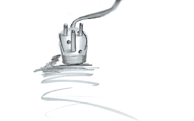
Finally, my focus for this drawing was detail and shading. Using the markers that I found, I tried to make the object almost 3D by using the lighter colours inside and working outwards, and focused on the detail of such a simple object - a plug. Ideally I'd have want to spend more time on the perspective as I think this might be a little off, but drawing this from free-hand was something I was quite happy with.

Overall I'm quite pleased with how I've improved during the session, I learnt a great deal from trying to get the perspective right on things which is what I struggle with most.