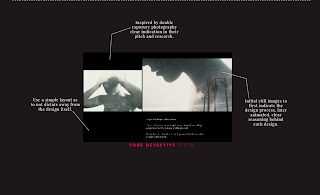
This InDesign Session looked at creating presentations and PDFS for our work to present upon. I’d already created my own pdfs several times before, for previous projects, so felt quite confident creating something for my posters.
Initially I wanted to look back upon what I’d already created, so chose to find the PDFS I was most happy with to go off a basis of research.
The most successful work in my opinion were the most minimalistic designs. My favourite one is the one I’d designed recently, for ‘Cybernetic Self’ with a small pop of colour to draw attention to each page. I’d always chosen simplistic, sans-serif fonts and my layout would always have as little as text as possible. What I’d learned from creating a PDF was to make it as simple as possible as it’s meant to be as presentation as such. For my more recent PDFS I'd started adding the logo I'd designed for my website and placed upon my CV, to give a cohesive layout to each work, and to sort of put my own "stamp" on it as such. This was a nice way of creating a layout that was quite simple but adding an arty flare to it. I also looked back at my final year project, which was one of my most successful projects to date and why it worked so well. I decided that the long line which breaks up the page would be something I'd keep using it, sort of to create my own mark on my work but also because it worked so well last time at splitting up information.
 The issue behind this project presentation was that I'd always create it based on the appearance of work and not to conform to the same layout, as this was something I'd enjoy making as much as the work. So it would be quite hard to say if I'd actually use this presentation for all my further projects or not just as practice to add the posters into. Either way it would still be an exercise for me to create to.


