Monday, 30 November 2015

Lecture: Design, Emotion, Perception & Illusion

Our first lecture with Tracy explored the emotional approach to design - that everything designed shouldn't just be for the purpose of 'design sake', but for emotional reasons. The lecture looked at our way of using our own senses and how we value them; because of the amount of information around our daily lives it's very hard for us to process a huge amount of information, so we, as humans, ignore things that we don't see fit as value - taking notice of the more important things.
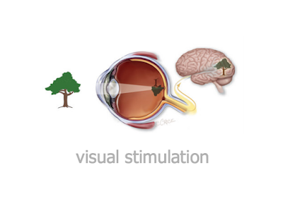
Looking at our most important sense - sight, which the brain processes up to 70% of the information solely on, we learned that we see everything upside down, shown in a Youtube Documentary and infact that our brain uncodes this so we can make sense of the world. This shows 'how the slightest thing can have a huge impact on on us and our behavior'

Perception: How we interpret to make sense to us. Depending on how we feel is how we interpret things, for example, when looking at something that has 'hidden' images in (see below) you may choose to see something that is otherwise not there to other people, all depending on what we feel at the current moment and actually want to see.


The lecture also looked at a BBC Four documentary which explored senses, particularly in the documentary there was a 48 hour expeirment where people were placed inside a bunker with no noise (showing an example of how we rely on sound) Eventually into the experiment a lot of the personnell involved starting visualizing things or creating their own noise, forcing a lot of anxiety between them and the situation. 

Every sense is essential to our development, we, as designers, have to look more into the emotional responses that our designs would influence someone into thinking a certain way, and not just from a design sake. Although the lecture, to me, wasn't very benefical, I can see why we need to look more in-depth at why stuff is presented in different ways.

Thursday, 26 November 2015

Lecture: Fears of The Dark

 
Fear[s] of The Dark - 2007

In this lecture, we looked at Fear[s] of the Dark, a french abstract horror movie created in 2007. Based on 'fear' itself, it was written and created by comic book creators and graphic designers. The film is split into 5 parts; our focus was the fifth part, which relied heavily on the use of shapes and two contrasting colours. This section of the film was mostly flat, using shapes and negative space to create characters and use the black background as the dark. Each section of the film is told in a slightly different way and the graphics change throughout each section, with textures being used for some sections, whilst the 5th block we look at relies mostly on the use of flat shapes.

The focus of the 20 minute section we looked at showed the vunerabilty of a man being locked inside a cabin after escaping a blizzard, and the paranoia that plays on him. Although this was only a flat-animation and was virtually black+white, it showed clearly the fear of the man of the dark and used the negative space well to play on his fears.

My favourite part of the film was how it was able to portray such emotion with limited shapes - the other sections of the film use texture and more detailed graphics, but this was very simplistic but was still able to capture the mans fear due to his facial expressions. Overall the style of the film reminded me of Persepolis, a 2007 animation based on the Iranian revolution.  The style of Persepolis, particulary with the shapes it uses and minimalist shapes, reminds me of what I see in this film too. Overall the film was interesting to watch and allowed me to show how expression in animation is a good way of showing the audience emotion, and that simplistic ones can be just as effective.


Wednesday, 25 November 2015

Lecture: Intros and Abstracts

To recap on our genealogy lecture - we were given the task to re-call five key words of the session, recalling them back with their own meaning:

  • History
  • Establishing Shot
  • Methodology - Knowledge of how to do something, "x" (Method)
  • Objective
  • Contingency
  • Subjective
  • Fabrication - Making/creating something from imagination or thought
  • Perspective
  • Pre-conceived - Assumption of something/already been created
Our focus for today's session was abstract; an overview of a phenomenon/thing, a brief summary of content. Introductions are prime examples of abstracts, as they establish and summarize the content of the essay/piece of work and create a mindset for the entire read. The idea behind this was to take this skill into our essay writing - it entices the reader by showing a summary of the content and engrossing them into the subject.

Witnail & I (1987)

The clip of focus was Withnail & I, a black-satire comedy film from the 1980's staring Richard E Grant and Paul McGann. The clip shown was condensed into 6 sections for each of our seminar groups to use. My section was the 20-40 seconds clip - the aim was to summarize what we'd seen in an abstract way, creating a brief, concise sentence.

"Scuffle between characters which is solved by panicked compromise"

My intention was to not work out what the characters were doing specifically, but sum up the intentions of them between the twenty seconds I was given. This is called "clipped writing", which condenses down a sentence with pace, content, meaning the words have purpose and direction. In Casablanca (1942), the film using clipped writing to create intrigue to make the viewer want to watch more. Shown in the clip below, the introduction of passing characters, summarizing the main character as "sentimental, cynical" it offers us a lot of information and description of the character without being that established into the film. Clipped writing offers a far better way of inciting the viewer as it gives them enough plot to keep them intrigued. 

Casablanca (1942)

Overall this offers us a way of starting our own essays, by "opening strong" with the first introduction/abstract being a way of bringing in the audience and creating a summary for the entire essay - be brief, concise and meaningful. Below I applied my own abstract with my proposal, which I'm used to doing in a long-winded form, I wanted this to be far more easier to interpret and actually entice the reader more;

INSERT ABSTRACT

After Effects: Speed and Motion to Character

The next After Effects production session was one that I'd really looked forward to. Our task was to create a character, in illustrator or photoshop, retaining the layer and layer sizes and then import the character into After Effects. We'd then proceed to animate the character, around the legs, face, tail etc or any parts that would make the character 'come to life.'


I chose a flamingo trying to keep it as simple as possible. Although I thought I'd selected quite an easy animal, when animating a 2D object it can prove quite difficult - we first had to make sure we'd keep the layer options and draw out each body part in separate layers, so we could easily animate each object without having to go through the process of destructing a flat image; I named them to make it easier on me to know which one I was animating. The process of importing the image was easier than I'd expected, we just had to select the option to retain the layer style.

I came up with many different obstacles when trying to animate my animal. Firstly, when moving the legs in the slightest way, it would show the gap where I'd tried to cut out the leg quickly, meaning that even the slightest movement exposed a gap in the leg of the animal, so the leg would have to be animated either very quickly or to not much of a big degree. The second thing was making the animal look realistic in its movement, depending on which animal would depend on how it would look when moving, so I had to research this in hindsight to make sure I could move the legs without it looking too stiff. This was one of the harder challenges for me, and although it's not perfect, I tried to make the animal look its best without revealing any gaps or errors I'd done.

Overall, I was really pleased with how my character came out, although really not perfect, it was nice to get to grips with animating different sections of the same composition, and bringing to life a character which I could use in later projects throughout my course.


Monday, 23 November 2015

Lecture: Message and Meaning

The difference between poetry and practical messages is that the latter are successful only when we correctly infer the intention.
                - Michael Rock

For this lecture, we took about exploring the definitions of Message and Meaning, and the structure of communication between client and designer, specifically when applied to graphic design. It's about how to communicate or imply an idea - and how it will be interpreted by those who receive it and the target audience.

Message: A short communication transmitted by words, signal or by other meaning, usually from one person or station to another.
Meaning:  What the source or sender expresses, communicates or conveys.

The focus was to apply a meaning to a message that is sent to an target audience. Namely, these needed to be tested and tried. As graphic designers we have to convey a certain message through our graphic styles, as these are far more visual interpretations of a message than writing everything down.

Send (Encode): Translating information into a message in form of symbols

This is why advertising companies in gathering audience data online; sending data to their audience is far easier if they know exactly what to encode to them, which thus profits them in terms of ROI. Applying this back to our current proposal, if we know more about the audience it is more rewarding and easier to receive positive feedback on our work, creating a successful project.

The sender should ask different questions:
  • Is immediate feedback needed?
  • Is message urgent?
  • Is documentation required?
  • Is the message being communicated to someone inside or outside?


The lecture was helpful for us, as when applying it to us, designers, we have to construct a message of communication through design to the audience/client. The way of communication is important to us as we need it to quickly present ideas that focus on being able to put ideas across efficiently.

Anthony Burrill

Touchpoint: Where the customer and the business/designer exchange information

For the remainder of the lecture, we looked at Marshall McLuhan, a figure in media studies and technology. His book was "The Medium is the Massage", originally read "message" but kept because of it's meaning, which shows visual examples of graphic design throughout. McLuhan is analytical about everything sent to him, picking out the smaller details of design and wanting meaning from everything.

To summarize, the developing world of graphic design and change is clearly a huge influence on how I create my work, trends change and to interact with clients and the audience of the work I'm currently producing I need to focus on the meaning behind everything I am doing, for example, taking my sketchbook research and developing the same style in my workbook. My focus is on making everything purposeful, otherwise it would not be needed; hence my simple designs.

Without feedback, the sender cannot confirm that the receiver has interpreted the message correctly.

Saturday, 21 November 2015

Physical Process: Interior Drawing


For my next drawing session, our focus was to look at the interiors of the Creative Arts building. I worked upon drawing with different marker pens to make the look more abstract, instead of going for a realistic approach - I'm not confident at drawing realistically so aimed to go for something that was a bit more unique and different.

For the first drawing, I opted to layer up marker colours to try and gain the look of the sun going down and the clouds getting darker, as well as the tinted windows; so I opted for different colours of marker pen and used two complimentary colours so they would fade together better. This was good practice for me as I've never used the markers before. The studies took longer than I thought to begin with as I had to layer a lot of them up with sharpies, fineliners and add colour and detail to them.

For the second drawing, my idea was to use marker pens that were contrasting (yellow and pink) to make the piece more abstract. I prefer this to the first drawing because of the minimalist use of colour I've used - it was much more of a challenge for me in terms of perspective and trying to create a vanishing point, as well as the smaller detail in the lights.


Layer adjustments to painting

My final drawing was done as a digital painting - I selected the best photo I'd taken from my phone and used this as a base to create something slightly abstract. By layering gradient maps and inverting colours, the effect in the painting was something similar to my original drawings - I didn't like the idea of making something accurate, as this is not what I'm best at doing. 

Although not as neat as I'd intended it to do, I prefer this as this creates a more abstract feel which is originally what I intended to do. I kept the detail to a minimal and focused more on the colour, creating a certain mood about the building which was captured better in this in comparison to my drawings. I definitely feel my advantages lie more in painting with my tablet (a Wacom Intuos) my aim was to use two colours opposite each other on the colour scale: I opted for a red and then mint green to highlight, creating some depth to the piece. This was one of my favourite things to do in the process drawings as it was something a lot more familiar to me, and, in my opinion, something of much better quality.

I would definitely look at using the same or a similar technique for my next drawing session; allowing me to further practice my digital skills and create something more similar to what I originally intended - it's far easier for me to create something of better quality, although I also want to practice my observational drawing skills so intend to keep drawing as well.


Wednesday, 18 November 2015

Lecture: Expanded Genealogy

Following on from our first lecture on Genealogy, we wanted to expand upon this and start applying this to our work and looking at the meaning more.
Although confusing at first, I found the lecture helpful with the visual aid that was given to us, mainly using the comparison of the Simpsons introduction and the Gotham evolution video to make some sense as to why we were looking at this in the first place.


The methodology of genealogy was looked at in the lecture, defined as "the way of doing genealogy" - although I didn't understand this to a massive extent, it related back to our work because of the way we look at things that isn't entirely black and white - there's a big grey area in between; which, when looking at our work and researching into it, this is what happens, as we don't know the entire picture, especially when using genealogy to this, as we are filling in the blanks.

The guardian commercial we focused on in the lecture also looked back at this. The idea was that historians don't have actual access to what happened in different periods of time when researching, they weren't actually there to witness the event - this may not be the truth, so, when researching, we have to fill in the blanks of research that we can't necessarily find out for ourselves and make an assumption. (This was backed up by philosopher Zizek, in his "from a bed" video clip)


American Beauty was shown as a visual example of how we can apply this method to our own work and the essay we're given at the end of the term. The five minute introduction to the film is establishing the narrative for the entire film, it makes you interested in the plot and introduces the characters without giving too much of the plot away, as Lester, the main character, is quickly shown as someone who despises his current life. This is what we should be applying to our essay - in the introduction, we should be creating a narrative from the start and enticing the person reading our work to want to continue reading it, plus giving a summary. I found this lecture very interesting in terms of the approach and the way the examples were referenced back to how to apply this to my work, and like the idea of using the films as ways of creating our own essay.


https://en.wikipedia.org/wiki/American_Beauty_(1999_film)


Tuesday, 17 November 2015

Seminar: Infographics

U.S Gun Deaths in 2013

Following on from our lecture in the morning, our seminar tried to reflect what we'd previously learnt - with Tracy we looked at problem solving design and communication. In short, we wanted to look at info-graphics (interpretations of facts and observations through graphic design). They help to simplify complex data to convey understanding, which is an essential skill for graphic designers - it needs to be memorable but visually beautiful.


The examples we explored in the seminar were from the Glasgow School of Art; one students work, shown above, by Sarah Jane Cassell - she chose to represent the "closeness" of her relations to other people, be that friends, family or others, using different colours for each person. The affect of her work is quite empowering to me - it represents quite clearly how she feels about each person, showing dips in the relationship and cut off points, leaving questions open to the people interpreting it (did she stop becoming friends with them or were other factors included?)

The idea for my response to the seminar came from this. I wanted to reflect my entire personality; from well-being, relationship, living arrangements, game time and work load. My idea was to have the same lines that Sarah had, using them to represent how happy this makes me. It was also a good practice for my proposal project, as I wanted to try something with minimalist/infographics for this.


Monday, 16 November 2015

Lecture: Influence & Behaviour


Influence - the capacity to have an effect on a character, development, or someone or something
Behavior - the way in which a person behaves in response

During this lecture, we looked at the commercialization of propaganda and advertising; focusing on campaigns that communicate with their audience and interact with them in a way that feels personal to the audience.

Edward Bernays was a pioneer whom, whilst propaganda was very much associated with the Nazi regime, developed a new name (public relations) for it and made it very much commercial. Himself, along with his uncle, Sigmund Freud, were able to create and make advertising more friendlier to the general public.

Our lecture looked at how advertising can be used to communicate to the audience - we focused on Charles Dana Gibson, an illustrator responsible for propaganda posters for World War 2, using meaning and graphic design to create a poster that would be much more relate-able to the audience. This marketing was used over the years for many campaigns, making it a much more interactive service than traditional branding, which is reflected on Bertha Hunt and the tobacco campaign that was associated with women's rights. Whilst this nearly back-fired, it was a way of the brand expanding their audience.

"They want to use you as an asset to their promotion"


Nike: Find Your Greatness.


The idea behind these campaigns was to make us consider who were designing for, and to focus on our audience - when associated with our current work, it made us look more at who are target audience would be for our project, how we want them to feel and why people feel how they do. I feel these adverts were able to capture this and reach out to normal people, which some adverts/campaigns - such as London 2012 - failed to do.

Sunday, 15 November 2015

Proposal


My proposals for part two of my project were mostly similar. My main interest was space, which I valued as an 'underappreciated' part of society, I wanted to highlight this in a way that was my style. My ideas relied on using Photoshop/online software to create something that would present data found in space in a visually pleasing way, particularly things that I would find valuable or interesting - my target being the wider public, maybe as a wider campaign to get people more interested in astronomy.

1 - Infographics in Space
A visual represetation of data to promote the discoveries in space; an underappreciated section of our world. Use to make data more visual and eye-catching to our broader society in a campaign to make us more aware of the area out of Earth

2 - Motion Graphics
A visual representation of space, data and information prepared for motion video, web or graphics makes data look visually beautiful and allows full exploration of data. 

3 - Self Portrait Map
A map, taken in the physical or literal sense, to express or explore my personality in its enterity. Visually explain self through graphics as a whole, including life, friends, family or interests. 

4 - Social Media
As something we do not value as society enough, Facebook has over 1.7 billion users - at least 1/6th of the global population. Explore and present either a personal response or not to this, wether that would be motion graphics or design - social media is a huge way of communication and a way we express ourselves openly online.

When creating the proposals I wanted them to look like a live brief - the words were chosen so it would look as if someone had given me the idea to respond to. I chose the first (Infographics in Space) proposal, this was the one that I could see myself doing and had the most research in my sketchbook to back up my work. My ideas were already in my head for what I wanted to do: create posters, possibility animated, that would re-spark the love of astronomy.

Initially motion was my focus of interest, I opted to present my pitch as a work book with pages of development in - having been told by John that it would be better to pitch with different designs, this was my reasoning behind it. Overall I'm glad I went down the workbook route as this makes it easier and more creative for me to present a few different designs and to just animate one poster, this would make a more interesting pitch than just going behind one set layout.

Friday, 13 November 2015

InDesign: Double Page Spread

For my second InDesign project, we looked at re-creating more complex layout spreads and using our own images (such as from bands etc) to create a response to this. Initially, I really struggled with keeping up with the pace that was required to keep moving on with the posters, especially during the In Design sessions.

The software proved difficult to get to grips with, and eventually I took it to myself to take a break from it and come back. My response was to re-create the second poster given, and I changed this to be inspired by Harry Potter. I used a found texture from website and used the grids as references for aligning up the type.


I really liked the outcome of this, although so simple I tried to keep to using the grids as much as possible; meaning that the text wasn't out of place nor over complicated.


We were taught how to create Text into it's own editable vector, making it easier to expand and be more creative with text and the layout, shown above. This is such a simple technique but creates more of an interaction between the text and a layout, allowing it to be used for a border or to make the layout more aesthetically pleasing.

Thursday, 5 November 2015

Workshop Week


Our workshop week was open for us to be able to for one or two days start and finish an entire project. I selected Wednesday's workshop session with Sara, creating an motion graphics Christmas Card with other people to place together in harmony for a video for the university.

For my card, I wanted to do something that was more personal to me, and to show off my skills in Photoshop. I took about making the card very complicated in design, in comparison to other people who stuck to making the animation more complex; My initial planning was to create something with subtle animation in, such as snow falling or the breathing of the fox I incorporated.

Although I wasn't able to finish this due to illness, I still really enjoyed the project and the start I made to it, I was inspired through pinterest ideas and my own likeness for things to create this. My idea was to create a few different frames and animate them subtly on after effects, possibly focusing on the text, fox, and some snow that I would add, as this would work better for my design than anything else.

Monday, 2 November 2015

Lecture: Gender and Difference

For one of Alison's lectures, we (the art department, photography, graphic design) looked at how society, art and we as people view Gender and Sexual difference and how this is interpreted in different works, from more older means of design right up to the modern day. I've always found although Alison's lectures don't necessarily relate to the course, they prove quite interesting as they're topics I find interesting as a whole and always spark a lot of debate between my peers, especially in the modern society that we live in today, where Gender and Sexual differences are becoming a lot more common than previously seen. Because of this, it was a nice break from the Graphic lectures I've grown accustomed to.

Firstly we looked at WAR (the Women's Art Revolution) that we can change the way history is constructed and viewed, having a digital input into this, and that current and future generations can break the way we currently view this, by creating their own histories. The forums sort of allow people to come together and collect, share and create their own works that let them contribute to the history of women's art.

The ideology behind women's art is that has been ever growing and changing, Alison showed us examples such as "Why Have Their Been No Great Women Artists?" or "Old Mistresses" which depict the history of women in art and the reasoning behind why, maybe, they're viewed differently to the male counterpart. Ideologies particularly are the focus of this as they're always manifesting and people make assumptions based on the ideology that they've heard or seen before, if something has been presented to them they're likely to follow it, too.

Although the lecture wasn't relevant to my course, it made me a lot more mindful about how differently our work can be perceived by different status of people, as well as gender, backgrounds and likeness, so it made me more aware to remind myself that I need to concentrate on creating a target audience and sticking my work to this. It proved an interesting lecture, although complex, and a nice change from my usual Graphic's ones.

Artist Research: Constellations


My focus for space was on Constellations. Although seemingly not that important, my idea was to concentrate on using Constellations as a way of presentation and for looking at layout styles, as they're simplistic but effective at presenting information.

An example is above, a project from Second Story, a company who at a event for Engineers created a way of allowing them to rank the most important topics to be discussed, by using an interactive mind map that allowed their names to appear on the info-graphic and be presented out onto touch screens.

This way of presenting data in a way that wasn't as boring as usual was something that I wanted to focus on. By using constellations, something that I initially researched in space, it was a way of combining the two together and creating something that was visually stunning to look at and also a way of getting the company to interact with one another, as this was a way of talking. The work was hugely influential on me because of the style of doing this; if I were to re-create this idea I would use after effects to generate points that would move around, similar as shown in the video.